Quantcast
Channel: Underpaintings
Viewing all 214 articles
Browse latest View live

Color Palettes: Sir William Orpen (1878-1931)

$
0
0

"(William) Orpen draws with just the same accuracy a turnip, a horse, or a complicated arrangement of figures . . . He is a very methodical, business-like Irishman, despising the word 'art,' and having no use for the word 'genius.'" ~ George W. Lambert, one of Australia's most distinguished painters, in an address to his students at the Sydney Art School


There is a story told among members of the Orpen family that says when the artist William was an infant, and still unable to hold drawing instruments in his tiny hands, that he tried to make sketches holding a pencil clasped between his lips.  As unlikely as anecdotes like these are, they are charming, and often form the mythology that surrounds an artist's life.  Ordinarily, these tales are born in retrospect, after an artist has achieved fame, but in the case of an extremely precocious artist like Orpen, the mythology surrounds the child at an early age and shapes the person into which they grow.

William Newenham Montague Orpen could have probably chosen any profession he wished.  He was born November 27th, 1878 to parents Anne, the daughter of Charles Caulfield, Bishop of Nassau, and Arthur, a successful Dublin solicitor.  His childhood home, 'Oriel,' with its stables and tennis courts, was large and comfortable, and his family, of which he was the youngest of five children, was never in want.  It could have easily been supposed that William would have followed in the footsteps of his father and two of his older brothers, and pursued law, but when he evinced a talent for art at a young age, his mother greatly encouraged him.  She, her husband, and the eldest Orpen boy, Richard, were, in fact, all talented amateur artists who had exhibited in Dublin, and Anne wanted at least one of her children to become a professional;  as the youngest, William was his mother's last hope for having an artist in the family.

At the tender age of 12, William was enrolled in the Dublin Metropolitan School of Art, where he quickly stood out for his hard work.  Already possessed of the "Protestant Work Ethic," Orpen put in long days at the school, leaving 'Oriel' each day at 9am, and not returning home until 10:30pm, when he would supper and discuss his work with his mother.  The pockets of his coat - or whatever coat he absentmindedly grabbed that day at school - were always stuffed full of his sketches, and his headmaster, James Brennan, upon seeing the young teen set up on a camp stool assiduously drawing from a statue at the National Museum, declared that Orpen would some day be President of the Royal Academy.¹

By the time he reached the prestigious Slade School in London at the age of 17, Orpen was already such an accomplished draughtsman that he was allowed to skip the first year curriculum of cast drawing, and move straight into the life drawing classes.  In the classroom, Orpen's fellow-students would gather around his easel to watch him draw, and whatever pencils or papers he was seen using became the de rigueur implements for his classmates, as they hoped the right tools might bring them closer to their idol.  And not only did his peers admire his work, so did his professors, who were known to conduct lively bidding behind doors, trying to acquire the young man's classwork.  During those years at the Slade, it was truly a one-man show, and that man was Orpen.²

After four years at the Slade, during which time he won nearly every accolade the school had to offer, Orpen decided to embark on his professional career.  His initial successes came as a result of showing at the New English Art Club, an alternate venue to the Royal Academy which appealed to younger artists and which was - because of political connections - particularly kind to Slade graduates.  Though he did well for the next several years, it was not until 1908 that his career really began to flourish.  In that year, seemingly unbeknownst to Orpen, one of his portraits was submitted by a patron to the Royal Academy for exhibition;  not only was it accepted, it was given a place of honor in the annual show.³  Orpen's acceptance by the RA (he was made an Associate in 1910, and finally a full member in 1919) opened the artist up to a wider audience of affluent sitters, and within a short period, he was one the most prosperous portrait painters in England.

During the last thirty years of his life, Orpen painted nearly 600 portrait and portrait groups.⁴  He was so busy, that outside his Chelsea studio, chauffeurs leaned against the hoods of the queueing limousines,⁵ and it was not uncommon for a departing client to meet the next sitter while crossing the threshold.⁶  And for each of the four years leading up to his death in 1931, Orpen made no fewer than £45,000 from his painting, an amount equivalent to over $3.3 million per year by modern terms.  In his best year, 1929, he made what amounts to 2.7 million British pounds - or over 4 million US dollars.

To accommodate the sheer volume of commissions Orpen was receiving, he enlisted the help of studio assistants.  These aides, such as Irishmen Sean Keating and James Sleator, had been exemplary students  Orpen discovered while teaching in Dublin, while others, like Englishman Reginald Eves, were Orpen's contemporaries⁷ at the Slade School and were taking on extra work while attempting to establish their own careers.  Their duties could range from preparing canvases, to laying in a copy over which Orpen would later work.⁸

Orpen was not adverse to occasionally employing photographs as a labor-saving expedient⁹, but to what extent he made use of the camera is not clear.  There is record of Orpen painting animals from photographs, but not people (though it is not inconceivable).  He did, however, have definite ideas on capturing a sitter's character, and not just his likeness, which would suggest a distaste for slavishly copying photographs:
The line which separates character from from caricature is very narrow and delicate.  It is not a difference that you can measure with a foot-rule . . .  It is a quality in the painter's mind that sees what a man is rather than what he looks like. For frequently, if you paint only what you see with your eyes, you will be painting a lie. . . . I have often seen unsympathetic or repellent photographs of a man who turned out charming when you met him.  The man had the same face but a different heart, and it is with the heart that the portrait painter is concerned.¹⁰
Orpen also considered it the artist's duty to "organize according to his aesthetic sense the material supplied by the camera," and never allowed the camera to design the pictures for him.¹¹

Much has been made of Orpen's reliance on the square for the compositional arrangement of his portrait paintings, a shape not commonly used in that genre.  Typically, Orpen would set his figure in a quite-obvious pyramidal shape by arranging the sitter's elbows on both arms of a chair, or by adjusting the sitter's pose so that their arms were placed akimbo.¹²   He would then arrange the curtain-folds of the backdrop in such a way that the diagonals ran from the upper corners to the center of the painting, rather than the customary placement of the drapery running from the upper center to the outside edges.¹³  This arrangement was particularly effective when the seated figure was in profile, and in such a manner, Orpen made use of this design for the length of his career.  By one estimate, he painted well-over 100 portraits with this composition, but considering his overall output, this does not translate to a high percentage of his paintings.  However, Orpen's popularity among young artists led many followers to adopt the shape, which for a time was quite fashionable.¹⁴

In his early paintings, Orpen was interested in depicting the qualities of natural daylight, and many of his best received works at the beginning of his career were subtle atmospheric studies of ordinary rooms which just happened to contain figures.  But as his focus changed almost exclusively to portrait painting, his choices in lighting also changed.  By illuminating his sitters from both sides, he eliminated the heavy shadows of his earlier, chiaroscuro-filled images, and this likely pleased his clients who were more interested in clear, unblemished representations of their visage rather than having portions of their face fade off into the backgrounds.  This did not mean he abandoned high-contrast images, however, as he frequently would place the well-lit heads of his clients against very dark backgrounds (this formula also likely allowed Orpen to speed up his painting process and thereby his productivity).

Prior to World War I, Orpen employed a restricted palette for his figurative paintings.  In 1914, while painting a portrait in Scotland, Orpen shared his colors with Frank Morley Fletcher, then director of the Edinburgh College of Art.  According to Fletcher, in his book Colour Control, when he asked Orpen to recommend a palette to the students, Orpen replied that he used only four colors - in addition to Black and White - when painting portraits.  These colors were Vermilion, Burnt Sienna, Yellow Ochre, and Cerulean Blue.¹⁵  

A decade later, in 1924, Orpen was still using a limited palette, but it was one that he had expanded somewhat.  This new palette, as recorded by Harold Speed in the book The Science and Practice of Painting consisted of ivory black, burnt sienna, raw umber, light red, white, permanent yellow, yellow ochre, deep cadmium, vermilion, cerulean blue, cobalt, viridian, and occasionally, rose madder.  (Speed also added that Orpen used copal medium for thinning his colors).¹⁶ 

As helpful as Fletcher and Speed are in sharing Orpen's color preferences, they unfortunately have little insight to offer into the artist's technique.

The only detailed accounts of Orpen's methods which remain were provided by Sean Keating, a leading painter of portraits and historical subjects in Ireland, and a President of the Royal Hiberian Academy.¹⁷  When Orpen first met Keating, he was a young man of 15 or 16, studying at the Dublin School of Art.  He quickly became Orpen's favorite student, and in 1915, when Orpen needed a a new assistant in his London studio, he chose Keating for the job.  Though Keating remained always an admirer of Orpen ("My life began on the day he looked over my shoulder in the Life Class," Keating said of Orpen in 1977.  "I have loved him all my life.  He is in my prayers every night."), he was only a studio assistant for two years.  At the outbreak of the first World War, Keating returned to Ireland to avoid being conscripted into British military service, and tried to convince Orpen to do the same, but Orpen instead enlisted, saying, "Everything I have I owe to England."¹⁸  The two remained friends, though not particularly close, for the remainder of Orpen's life.

During an interview with Radio Eireann in 1936, Keating had this to say of Orpen:
What he observed seemed to go in through his eyes, be analysed and arranged by his brain, and written down with inevitable rightness by his unerring hand, as one complicated movement of his will.  He painted at an incredible speed without alterations or erasures, and then, if it was not exactly what he wanted, he simply wiped it out and began again – but that was seldom . . . He taught that sufficient paint to create the illusion of light and shade, of tone and colour was enough, and laughed at 'touch,' 'impasto,' 'heureux saleté,' and, to use his own words, 'all that sort of tosh'.  He knew how to draw exquisitely with the point, whether with the brush, or a piece of chalk or a lead pencil.  And again, to use his own words:  'Either you can draw or you can't, and that's all there is to it.'  This mental clarity and hatred of evasion led, as time went on, to the extraordinary breadth, simplicity and conciseness of his later work;  the method sinks entirely into the background, and what the picture  says is as forcible and laconic, as emphatic and as authoritative, as the shot of a pistol.¹⁹

Then in 1977, in an interview with Orpen biographer, Bruce Arnold, Keating added to his description of Orpen's working habits.
Orpen worked in a temperature of 70˚F, since he suffered greatly from the cold.  He painted on 'K' quality canvases, bought from his brother-in-law, Jack Knewstub, at the Chenil Galleries in Chelsea.  The canvases were primed with marble dust, and were blue-grey in colour.  The texture was very rough.  According to Keating it had 'a good bite, a great tooth in it'.  He used a priming medium of equal parts linseed oil and good quality turpentine, and gave to his canvas a tint-coating all over of Van Dyke brown, burnt umber or raw umber, or a mixture of these.  His palette was limited.  Keating remembers a range which included flake white, crimson lake, orange vermilion, chrome yellow, blue, black, veridian (sic) green, raw and burnt umber, burnt sienna.
The advantage of burnt umber, which Orpen generally used for the preliminary outline, was that it dried, in Keating's words 'like the devil', and was very hard to 'move'.  Having given the canvas an overall colouring of translucent brown, Orpen's first attack, in monochrome, was 'fundamentally that of a draughtsman.  He knew that if the head was right, everything else would follow.  And what mattered in the head was that triangle, two eyes and the nose.  Never the mouth.  The bones under the cheek;  they had to be right.  Then away he'd go, bringing it all along together, a touch to the eyes, the nose, then back to the face, darting in and out, nimble, alert, always quick and decisive in all his movements.'²⁰

No analysis of Orpen's color choices would be complete, however, without awareness of a mediating factor in Orpen's life – the artist was colorblind.  This condition seems not to have been widely known, though comments about his palette were sometimes made ("Mr. Orpen is not thus far a colorist in the full comprehension of the term.  His palette has little downright chromatic brilliancy."²¹).  It seems his deficiency was not openly acknowledged until the publication in 1927 of the diaries of Orpen's friend, Lord George Riddell: 
He (Orpen) says he is a little colour-blind, in as much as he sees red as pink.  I think he tries to correct this defect in his pictures – not always with the happiest results.  He makes some of his sitters look too rubicund.²²
Apparently, Orpen had protanomaly, or "red weakness," a color deficiency which affects approximately 1% of the male population.²³  To the protanomalous Orpen, any red he saw would have been reduced in value and chroma, and other colors, such as orange, yellow, and yellow-green would have likely appeared to him as shifted slightly in hue towards green.  Colors like violet, on the other hand, would have appeared as blue.  It is interesting to note that Orpen tried to compensate for the color deficiency as his career progressed, rather than paint in a lower key, as most other colorblind artists would have done;  this was quite likely a necessity considering the colorful livery he had to reproduce in his portraits.

In terms of financial gains alone, William Orpen was one of the most successful British portrait artists of the 20th century – if not the most successful – yet he is little known today.  He himself predicted, "Twenty years after I die nobody will remember me,"²⁴ which was an unfortunate but prescient prognosis.  But why is that the case?  For William Orpen, not only was his family responsible for building the myth that shaped the artist, they were also responsible for tearing it down.

In 1952, Sir John Knewstub Maurice Rothenstein, when he published his book Modern English Painters, wrote what was perhaps the most damning criticism of Orpen.  Rothenstein, who was Director of the Tate Gallery in London from 1938 to 1964 and therefore a man of importance and influence in the art world, was dismissive of Orpen and his accomplishments.  "I have seldom known any man, and never a man of superior talents, with so little intellectual curiosity and so feeble an intellectual grasp, or with so contemptuous an attitude towards the life of the mind as Orpen."²⁵  Rothenstein blamed Orpen's early entry into art training for stunting the artist's mind, and claimed that one of his award winning works from his days at the Slade marked the apex of his career as a painter.  The book was well-received and oft-quoted, and did nothing to help Orpen's reputation.  And if at times the attacks on Orpen in the book seemed personal, it should come as no surprise then that its author, Rothenstein, was  the artist's nephew.  

Perhaps it was Karmic.  Orpen, with his many public affairs and his issues with alcohol, destroyed his family, particularly his wife Grace (née Knewstub).  It was as likely that Rothenstein's opinions reflected his parents' singular feelings for Orpen, as they did the period's fashion of favoring "everything but realism."²⁶  But whatever the motivation, the damage had been done.  It has only been in the past few years that Orpen's paintings have begun to regain the prestige they once enjoyed.


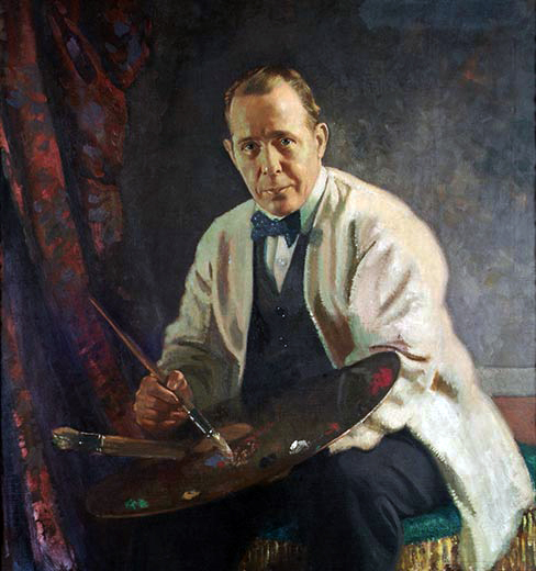
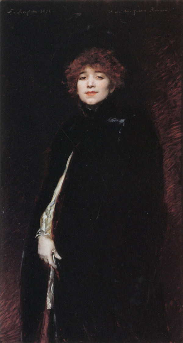
Portrait of Sir William Orpen by one of his Irish studio assistants, James Sleator.


¹ Konody, P.G. and Sidney Dark, Sir William Orpen:  Artist & Man, (Seeley Service & Co., Ltd, London, 1932), p. 27.
² Meynell, Wilfrid, "William Orpen," in The Artist, September, 1901, (Truslove, Hanson, & Comba Ltd., New York), p.177.
³ Konody, p. 209.  Konody and Dark list the year in which the painting in question, a portrait of Orpen's patron Charles Wertheimer, was hung in the "gem room" of Burlington House as 1910;  In Orpen:  Mirror to an Age, author Bruce Arnold, though referencing Konody and Dark, lists the year as 1908.  It is possible that the two sources are referring to separate paintings of Wertheimer (there are more than one known), and the story surrounding the honored display may have become inextricably linked to more than one canvas.  1908 was, however, the first year in which an Orpen painting was submitted to and accepted by the Royal Academy.
⁴ Konody, p. 221.
⁵ Upstone, Robert, William Orpen: Politics, Sex, & Death, (Imperial War Museum, Philip Wilson Publishers, London, 2005), p. 28.
⁶ Konody, p. 209.
⁷ Two years Orpen's senior, Eves did not achieve his Associate membership with the Royal Academy until 1933, and his full standing as Royal Academician until 1939.  Orpen paid Eves 100 guineas for "laying in a copy" on which he would "then work afterwards."⁸
⁸ Upstone, pp. 28-29.
⁹ Konody, p. 182.
¹⁰ Konody, p. 194.
¹¹ Konody, p. 182.
¹² Konody, p. 222.
¹³ Konody, pp. 222-223.
¹⁴ Konody, p. 193.
¹⁵ Fletcher, Frank Morley, Colour-Control: The Organization and Control of the Artist's Palette, (Faber & Faber Ltd., London, 1936), p. 17.
¹⁶ Speed, Harold, pp. 251-252.
¹⁷ Arnold, Bruce, Orpen: Mirror to an Age, (Jonathan Cape Ltd., London, 1982), p. 170.
¹⁸ Arnold, p. 301.
¹⁹ Arnold, p. 171.  Arnold is quoting Sean Keating, "William Orpen:  A Tribute," in Ireland Today, vol. 2, 1937.
²⁰ Arnold, pp. 170-171.
²¹ "Exhibition of Paintings by William Orpen," Academy Notes, volume IX January 1914 - October 1914, (Buffalo Fine Arts Academy), p. 134.  "Mr. Orpen is not thus far a colorist in the full comprehension of the term.  His palette has little downright chromatic brilliancy.  He is, rather, a luminist, and light with him becomes a veritable living presence.  It is in his manipulation of light that he evinces his incontestable mastery and it is out of light that he evokes his subtlest yet most significant effects."  
²² Arnold, p. 369.  
²³ "What is Colorblindness and the Different Types?" retrieved July 25, 2013 from [colorvisiontesting.com/color2.htm].
²⁴ Arnold, p. 8.
²⁵ Rothenstein, John, Modern English Painters:  Sickert to Smith, (Eyre & Spottiswoode, London, 1952), p. 221.
²⁶ Arnold, p. 404.


Max Ginsburg NYC Still-Life Workshop September 2013

What's in a Name?

$
0
0
Is this painting by Richard Edward Miller, or Richard Emil Miller?

In the arts, there have been many persons who have used professional names other than that given to them at birth.  The use of a pseudonym is perhaps most prevalent in Hollywood, where actors have chosen working names which, like John Wayne (Marion Morrison) and Cary Grant (Archibald Leach), were better signifiers of the masculine, leading roles for which the movie studios cast them, or those like Helen Mirren (Ilyena Vasilievna Mironoff) and Ben Kingsley (Krishna Pandit Bhanji), whose names were changed to make them less ethnic and more palatable for the Americentric audience.  Musicians frequently use stage names or nicknames, like Ringo Starr (Richard Starkey), Sting (Gordon Sumner), and Muddy Waters (McKinley Morganfield), and authors too are famous for making use of nom de plumes, such as George Eliot (Mary Anne Evans), George Orwell (Eric Arthur Blair), and Richard Bachmann (Stephen King), to name just a few.  Most recently, the extremely successful, British YA author J.K. Rowling was in news for releasing a piece of adult crime fiction under the name Robert Galbraith, a deception she used to relieve herself of the stress fan expectation often incites (incidentally, "J.K." is another pseudonym - the publishers thought the non-gender specific initials might encourage sales when her books were first published.  The "K" actually stands for nothing, as Ms. Rowling does not legally have a middle name, though she has recently declared that the "K" is for "Kathleen").

But what about artists?  How often do artists make use of an assumed name?

There are certainly artists who are better known by other names.  Rembrandt and Michelangelo are two historic precedents of painters being associated with a single name, while Pino and Donato are more contemporary examples of the same practice.  Some artists, most assuredly, have decided to use different names depending on the nature of their works, choosing one appellation for their commercial art, while another for their gallery work;  I still cannot conjure up Malcolm Liepke without first thinking of Skip Liepke, the nickname by which he went during his earlier, also-successful, illustration career.  And artist Tom Kidd is another who comes to mind, as he has variously used his own name, Gnemo, and Newell Convers (a nod to N.C. Wyeth) depending on the projects which were at hand.


The Seven Deadly Sins and Seven Cardinal Virtues
by Tom Kidd

Winsor McCay City
by Gnemo (Tom Kidd)

The Printer's Devil
by Cortney Skinner and Newell Convers (Tom Kidd)
(to further confuse the attribution, in his monograph,
Kiddography, Kidd claims his British cousin, Chico,
is actually Convers!)


There is, however, one artist who lives online, in books, in auction houses, and in museums, under two different names, who never intended for his separate identity to exist.  What is most surprising – and confounding – is that the simple mistake which led to the second persona should still go on, uncorrected, 70 years after the artist's death, and more than 100 years after the initial misappellation.


It was during the second half of the 19th century, when serious art students commonly traveled to Paris to further their studies, that a singular painter from Missouri was mistakingly split into two artists - one an American, and the other a Frenchman.  When the prodigiously talented American Richard Edward Miller (1875-1943) arrived in Paris in 1899, he immediately fell in love with the creative culture, and made France his home.  His summers were spent in Giverny, teaching visiting students from Mary Wheeler's art school in Rhode Island, while his winters were spent in the city, teaching at the École Colarossi.  So ensconced had Miller become in France, that his students applied a French flair when pronouncing his name ("Millaire")¹, and in an article on American artists working in France which appeared in a 1909 issue of the Gazette des Beaux-Arts, Miller was included only as a footnote; the author, Walter Pach, admired Miller, but did not consider his art fundamentally American.²  Ricahrd Miller became a true expatriate, and for many years, only returned to the United States for brief working visits.  If World War I had not arisen, it is likely that Miller would have remained in France for the remainder of his life or as long as the country would have had him.


In 1909, Miller and Frederick Frieseke, a peer of his from the Giverny Group of American painters, were given special invitation to exhibit at the Eighth Venice Biennale.  Between the two artists, they showed 28 paintings³ in a room – adjacent to the American pavilion – which had been reserved just for them.  The critics praised the paintings, and so taken were the Italians with the artworks that the Modern Art Gallery of Venice purchased Miller's Il Bagno – a seated nude bathing by lamplight – directly from the show.⁴  For Miller, it was a great honor and a great success, and this is probably why he willingly overlooked the small error in the Biennale's official program;  the Italian printer, perhaps thinking Miller – who signed his paintings either "R.E. Miller" or just plain "Miller" – was actually a Frenchman, had listed him as Richard Emil, rather than Richard Edward.  It would have been costly to reprint the pamphlets, and really, what was the damage?  Who would have expected that both names would have continued to exist, side-by-side, a century later.


Why this particular mistake should have endured so long is a mystery.  The two-man show at the Venice Biennale of 1909 was an important event in Miller's career, but it was far from the only honor Miller was to receive:  that a particular brochure should be responsible for branding him with a new name is surprising.  Perhaps the rather consistent misuse of "Emil" was a scholarly mistake, and was never an issue during the artist's lifetime.  If it had been common while Miller was alive, and it had bothered him, he certainly would have commented on the fact, as he was not one to hold his tongue.  Or perhaps for a man who was certainly a Francophile, he would have welcomed receiving a French name, and therefore being more fully associated with the culture he loved.


----------------------------------------------------------------------------------------------------


• For More on Richard E. Miller, visit this earlier Underpaintingspost.

• The Venice Biennale, including the 55th International Art Exhibition, is now being held (through August 11, 2013).  For more information, visit the website www.labiennale.org.

• The Worlds of Tom Kidd.

• Kiddography: The Art and Life of Tom Kidd

Cortney Skinner Illustration.

Donato Arts.

A Bright Oasis: The Paintings of Richard E. Miller


----------------------------------------------------------------------------------------------------


¹ Kane, Marie Louise, A Bright Oasis : The Paintings of Richard E. Miller, (The Jordan-Volpe Gallery, New York, 1997), p. 22.
² ibid., p. 34.
³ ibid., p. 27.  Frieske contributed 17 paintings, while Miller exhibited 11 – four portraits, five women in interiors, and two landscapes.
⁴ ibid., p. 28.


I Found it on eBay

$
0
0

An original oil painting by Paul McCormack, currently up for bid on eBay.


I used to worry that I was addicted to eBay.

Every morning, a bushel full of emails greeted me, filled with details of all the results from the dozens of searches I had saved on the eBay site, and I sat there and dutifully went through each of them.  It's not that I bought a lot - I was just fascinated by the different items that people posted for sale.  And over time, I had gathered some interesting items for my studio, including a hot plate for making mediums, a double boiler, amber bottles, vintage hats, costumes, rare books, quail eggs (hollow), and a bowl-backed mandolin.  I think it was the day I found myself shopping for human skulls - and yes, there are human skulls for sale on eBay (and they are even priced better than their professionally cast, plastic counterparts) - that I decided to rein in my shopping.  (Where were they getting these skulls anyway, and if I bought one, would my demand be fostering someone's grave-robbing side business? The prices were good though . . .)

The one area of eBay I still do monitor from time to time, though, is original art.  Unfortunately, most of the time that I peruse through those auctions, it can be very painful;  there is much chaff to sort through to find the wheat.  But it's still worth the search.

A few years ago, I picked up the little sketch shown below.  I have no idea who drew it, and I can only hope that it is actually from the 19th century.  The seller was located in France, and was selling several images that looked like they were all cut from an old sketchbook.  It is small (approximately 6 X 3 inches), and was inexpensive;  I think I paid $15 for it, which was worth it to me to feel like I owned a piece of history.

The painting below the sketch, "Morning at Superstition," I did not buy.  It was not for a lack of trying, however. The artist, Mick McGinty, was putting up one or two landscapes a week for a while, and I bid on a lot of them.  I was just never the last bid.  Unfortunately, McGinty  stopped listing works about two years ago, otherwise, maybe I would have won one by now.

Currently, I'm watching two auctions of original paintings:  one, a still life by Paul McCormack, and the other, a still life by Clinton Hobart.  I wouldn't mind owning either of them, but I have kids now, so I cannot afford to win either auction.  But I do like to see what's on the auction block, and I enjoy cheering on the bidders.  

And that brings me back to where this all started:  I'm worried I might be addicted to eBay.


Mick McGinty's artwork can be seen at his website, and on his blog, Twice a Week.
The eBay listing for Paul McCormack's still life is 281113035939.
Clinton Hobart's listing is 230986118843


unknown 19th c. French artist


"Morning at Superstition" by Mick McGinty

"Coconut & Mango" by Clinton Hobart, currently on eBay.


Kassan, Schmid, Gerhartz, and Zorn . . .

$
0
0


Now that we are nearly to the halfway mark of 2013, I have been thinking about the many great items scheduled for release this year, and which should be coming out in the next few months.


________________________________________________________________________________


The first of these items that I have been looking forward to is David Kassan's new painting DVD, Painting a Life.  It is a companion piece to his earlier instructional DVD, Drawing Closer to Life, which debuted a few years ago.  Drawing Closer to Life has been highly praised by viewers throughout the world, and Painting a Life promises to be just as popular.  I happened to be on the DVD's website a minute after it went live, and though Kassan was still in the process of tweaking the site at that point, there were already orders coming in.

Painting a Life is six hours long, and follows Kassan throughout his process of creating one of his meticulous portraits in oil paint, from pencil sketch to the final brushstroke.  Included in his progression are discussions about his materials, his studio setup including advice on lighting, how he prepares a panel, and a talk about oil paints and color with Gail Spiegel, one of the founders of Vasari Classic Artists' Oil Colors.  And as a bonus, Kassan, who likes to infuse all of his teaching with comedy, has included a blooper reel at the end of the disc.


As of now, supply is limited to only 250 copies.  Randomly inserted into five of those first 250 sales will be a GOLDEN TICKET which will entitle the holder to a prize package yet to be determined.  These packages are likely to include products from the film's sponsors, and there is also a rumor that one lucky winner might receive an original alla prima painting by Kassan. Kassan has kept the initial supply low to give participants a better chance to win (1 in 50).


The price is $129.95, with free shipping within the United States ($15 global shipping).  It was shot in High Definition Widescreen, and was formatted for Region 0 (universal).  These are pre-sales only;  the actual shipping date is not expected to take place until this winter.

You can place your orders at paintdvd.davidkassan.com.


________________________________________________________________________________


Another item to which I am looking forward to is the release of Richard Schmid's book, Alla Prima II.  Although his earlier book, Alla Prima is one of the best instructional books of the 20th century, Schmid, it appears, felt he could make it even better.  From what I have read online, Alla Prima II appears to be a revised edition of his earlier book, which was originally published 15 years ago.  Alla Prima II will include new written content as well as expanded explanations of the lessons printed in the earlier version. It will feature 262 color plates personally edited by Schmid, and, at an expected 300 pages, it should be NEARLY TWICE THE LENGTH OF THE ORIGINAL BOOK. Alla Prima II is scheduled for release this September.

Please check the West Wind Fine Art website frequently for updates on the book.


________________________________________________________________________________


I have also been looking forward to the release of Daniel Gerhartz's new DVD The Beginning of Autumn.  An earlier DVD of his, Her Mother's Locket, was one of the first painting DVDs I ever purchased, and I cannot wait to add this one to my collection.  I am uncertain when it will be released;  I think it was held up in post-production, but I have my hopes it will be available soon.  For more information, and to keep apprised of the DVD's eventual release, please visit Gerhartz's website, or subscribe to his blog.


________________________________________________________________________________


I am also anticipating the release of the book Anders Zorn: Sweden's Master Painter.  It is due for release October 29, 2013, and is currently available for pre-order at Amazon.com.  The 224 page hardcover is designed to accompany a major retrospective of Zorn's work, to which I am also looking forward.  That show will take place at the Legion of Honor in San Francisco this November.


________________________________________________________________________________


And one last thing (of the many) which I am looking forward to, is Kara Ross' catalogue raisonné on the British artist Edmund Blair Leighton (1852-1922).  I have no idea how much Ms. Ross has completed on this monumental project, and I highly doubt it will be ready to go to print before the end of this year, but I can still dream.  Blair Leighton is one of the artists I greatly admire, and I will be purchasing the book as soon as it does come out.


On View:  "New Works : New Directions" at Haynes Galleries, Thomaston, ME

$
0
0

Kerry Dunn
Toto & I
oil on canvas
40 X 30 in.


On view now through the end of the month at Haynes Galleries, Thomaston, Maine, is New Works : New Directions, a group exhibit showcasing contemporary, American, representational art.   Twenty-one artists  – some well-established, but most, rising stars – are represented in the show by nearly four-dozen portraits, still-lifes, and landscapes.  Gallery owner Gary R. Haynes, an ardent admirer and collector of 19th, 20th, and 21st century American realism, was drawn to these artists because their work is "honest, reflective and thought provoking."
“I am attracted to these artists not just because they are skilled realists,” says Haynes. “Certainly, they have mastered the technique and the craft, but it’s also much more than that. They are capable of conveying an emotion, mood and feeling in their work. They start with an idea and they communicate it in profound ways. It’s much more than pretty pictures. Their work commands attention.”
Haynes Galleries is located at 91 Main Street, Thomaston, Maine. Its hours are from 10:00 AM to 4:00 PM, Tuesday through Saturday, or by prior appointment.  For more information, call (207) 354-0605, or visit  www.haynesgalleries.com.  Owner Gary Haynes can also be reached directly, either by email garyhaynes@haynesgalleries.com, or by phone, (615) 430-8147.

New Works : New Directions remains on view through August 31, 2013.


Kerry Dunn
The Necklace
oil on linen
22 X 18 in.

Kerry Dunn
Back of Her Neck
oil on canvas
22 X 28 in.

Scott Burdick
Lilies
oil on canvas
59.5 X 23.5 in.

Martin Arnold
Kim 2
oil on panel
36 X 54 in.

Martin Arnold
Christina in Stripes
oil on panel
32 X 48 in.

Martin Arnold
Melanie
oil on panel
48 X 32 in.

Ryan S. Brown
Jessica
oil on linen
9 X 6 in.

Bo Bartlett
Indian Blood
oil on Masonite
11 X 14 in.

Milixa Morón
The Enlightenment
oil on linen
23.375 X 35.25 in.

Milixa Morón
Lisa, Chica Lunar
oil on linen
39.37 X 27.5 in.

“I strive to paint these kinds of themes not only because I like them but also because I love the feeling they transmit to me,” says Milixa Morón. “For a while I become them. I feel their knowledge, their pain or agony, their power, their mystery.”

Milixa Morón
Yara
oil on linen
39.125 X 27.187 in.

Justin Hess
The Blue Lehenga
oil on linen
40 X 28 in.

Seth Haverkamp
The Matriarch
oil on board
49 X 36 in.

Seth Haverkamp
Essie's Headdress
oil on canvas
48 X 36 in.

Seth Haverkamp
Blue Eyes
oil on board
24 X 18 in.

Henriette Wyeth
Portrait of a Young Girl (Gail Vanderbilt Whitney)
oil on canvas
20.5 X 18 in.

Burton P. Silverman
Arcadia Again
oil on linen
40 X 30 in.

Burton P. Silverman
Red Scarf
oil on canvas on panel
22 X 23 in.

Burton P. Silverman
White Scarf
oil on canvas on board
12.5 X 10 in.

Gregory Mortenson
Self Portrait in a Russian Hat
oil on linen
16 X 14 in.

Stephen Scott Young
Island Girl
watercolor on paper
22 X 12 in.

Stephen Scott Young
Claudia's Grandpa
watercolor on paper
30 X 22 in.

Adrian Gottlieb
Elysian Fields
oil on linen
36 X 24 in.

Alicia Ponzio
Irving
bronze on Belgian marble base
20 X 10 X 10 in.

Justin Hess
Still Life with Grapes and Pitcher
oil on linen
18 X 16 in.

Milixa Morón
Afternoon Tea
oil on linen
23.188 X 13.25 in.

Milixa Morón
Spring in Asia
oil on linen
13.25 X 19.25 in.

Milixa Morón
The Wishing Well
oil on linen
19.375 X 23.375 in.

Nicholas M. Raynolds
Man and All the Things He Keeps
oil on panel
16 X 31 in.

Nicholas M. Raynolds
Scrolls and Books III
oil on linen
14 X 32 in.

Yin Yong Chun
Large Plate of Walnuts
oil on canvas
36 X 36 in.

Yin Yong Chun
A Bowl of Persimmon
oil on canvas
12 X 12 in.

Tanya Bone
Salvation is Coming
oil on board
12 X 16 in.

Grace DeVito
Yellow Roses and a Tea Cup
oil on canvas
12 X 16 in.

Grace DeVito
White and Magenta Peonies with a White Cup
oil on canvas
10 X 10 in.

Krista Schoening
Bouquet
oil on linen
22 X 16 in.

Kerry Dunn
Plant
oil on canvas
36 X 28 in.

Kerry Dunn
Roses in a Green Bottle
oil on linen
20 X 16 in.

Bennett Vadnais
Locust Trees
oil on panel
30 X 24 in.

Gail Wegodsky
Fleur Valise
oil on linen
36 X 30 in.

Gail Wegodsky
Sandy Bitches
oil on board
20 X 12 in.

Gail Wegodsky
Solitary Soldier
oil on canvas
52 X 44 in.

Gail Wegodsky
Wet Umbrella Plant
oil on linen
30 X 22.5 in.


The Palette for the First Painting (1851)

$
0
0

A copy of the 1913 edition of  The Art of Portrait Painting in Oil Colours.

In 1851, Henry Murray, F.S.A. released the booklet, The Art of Portrait Painting in Oil Colours.  It was  published by Winsor & Newton, Limited, as part of a series of instructional books which came to be known as the "One Shilling Handbooks on Art." For eighty years, the book remained in print, until a diminished interest in representational art made the information contained in the book no longer relevant to the public's interests.

As a business idea, the Shilling Books were a smart device used by Winsor & Newton.  The company must have realized that to increase their profit they needed either existing artists to buy much more of their product, or they needed many more artists who were in want of art supplies.  But there was a problem with each of these proposals – with the former idea, there were certain limitations on how quickly artists exhausted their supplies, so even loyal customers would not likely be forced into replenishing their materials frequently (with, perhaps, the exceptions of white paint and canvas) ;  and the  issue with the latter idea was that art training was expensive and lengthy, so the number of artists in need of supplies was not rapidly growing.   Sacrificing the quality of their goods to cut cost would have just pushed customers of Winsor & Newton toward their competitors, or would have encouraged painters to continue with earlier practices, like grinding their own paint, instead of buying items pre-made from the colourman.   But someone must have realized that there was a large market to be had if there were only more hobbyists taking up painting, and this is where the Shilling Books came in :  for a relatively modest amount of money (around $6.25 in today's currency), a fledgling artist could pick up a small book of practical art instruction derived from the then current practices, and after a short read, be ready to put their new-found confidence and knowledge into practice.  And, should the new artist happen to need supplies, there was, conveniently located in the back of the booklet, a full catalog of Winsor & Newton's wares.  (of the 136 pages in The Art of Painting in Oil Colours booklet, 64 pages are devoted to the W&N catalog, and this is also the only section of the book with illustrations).


A page from the October 1912 Winsor & Newton catalog as included in a Shilling Handbook.


The One Shilling Handbooks were in print for many years, and covered many areas of art.  By 1913, there were at least 47 books in the series, covering topics such as marine painting in watercolors, landscape painting in oil, etching on copper, pen and ink drawing, and book illumination.  Periodic updates were made to the books over the years, but these changes were, at least in specific regard to The Art of Portrait Painting in Oil Colours, mostly concerned with modernizing the language.¹  

The information in the booklet is good, if a bit brief and generic.  It remained in publication at least through 1933², but it is not likely that it lasted long after that – the instruction was a bit outdated by then, and in the face of Modern Art, there would have seemed little need for a technical manual focussed on representationalism.  Oddly, there is little known about the booklet's author, Henry Murray, F.S.A. ;  not only were there multiple artist/authors by that name in England, there were also multiple meanings for the initials F.S.A., including Fellow of the Society of Antiquaries and Fellow of the Society of Artists.³

Several of The One Shilling Handbooks can be found digitized online at Google Books, or at the Internet Archive.  An excerpt from The Art of Portrait Painting in Oil Colours is included below.


THE ECONOMY OF THE PALETTE

The economy of the palette, and the composition of tints, have always been difficulties in the early practice of the student.  It is hoped that the arrangement and the tints which we are about to propose will save such time in doubtful experiment, and guard against mortifying failures.  It is a common plan to mix but a few tints, and to strengthen or reduce them by adding colour with the point of the brush at the moment when they may be wanted.

The series of tints presented in the following tables are, for the chief part, employed by the most eminent men in the profession.  They are the results of the practice and experience of entire lives devoted to painting ;  their adoption by the beginner will save him much anxious thought and experiment, and secure a result which he could never hope to attain by his own unaided efforts.

It is very rare to find two painters working with precisely the same colours and tints, preference and feeling having much to do with the selection.  If an artist be asked if he employs some certain colours which may be commonly used in flesh tints, he will perhaps answer that he does not, or cannot, use them.

The arrangement and the composition of the following colours and tints upon the palette, with the assurance that they will produce delicacy of the carnation hues, is a great step towards a successful imitation of life-like colour ;  but it must not be supposed that it only remains to apply them to the canvas.  It will be found that there is yet much to be learnt which no rules can supply, and that nothing but application can teach.

It is also necessary to learn how far these colours and tints are available in imitating the life and warmth of the human complexion, and the various surfaces and textures which occur in nature.  With a few colours, a masterly hand will produce the most charming examples of art ;  but in order to qualify the hand and eye with co-operative powers equal to the production of such results, a course of assiduous practice is indispensable.  The degrees of the tints, their relations with each other, and their adaptability to the imitation of transparent shapes and delicate hues, must be closely studied.

If the complexion about to be painted is that of a lady or a child, preference will be given to the most tender tints, broken with pearly greys, softened into shades laid as a ground for a transparent glaze.

If the complexion of the sitter be of stronger character, tints of a more decided tone – such as will approach the life – may be employed.


THE PALETTE FOR THE FIRST PAINTING

It will be understood that the variety of compounds in the following arrangements is given with the object of meeting every possible diversity of shade and hue.  It will therefore not be necessary to place upon the palette, at one time, more than a selection of colours and tints, according to the complexion.

These tints may be mixed upon a glass or marble slab, and placed upon the palette with the palette-knife, in such order as may bring the brightest to the extreme right, graduating them round to the left until the shade tints are placed, and to these may succeed pure colours.

COLOURS AND TINTS FOR THE FIRST PAINTING.

Colours :

White.                             Naples Yellow.
Yellow Ochre.                Raw Sienna.
Light Red.                      Vermilion.
Venetian Red.                 Rose Madder.
Raw Umber.                   Ivory Black.
Terre Verte.                    Vandyke Brown.

Tints :

White and Naples Yellow.
White, Naples Yellow, and Vermilion.
White and Light Red.
White, Vermilion, and Light Red.

For Grey, Green, and Half Tints to Meet and Break the Carnation.

White, Black, and Vermilion, mixed to Reddish or Violet Greys.
White, Black, Indian Red, and Raw Umber.
White and Terre Verte.
White, Terre Verte, Black and Indian Red.

For Carnations :

White and Rose Madder.
White and Indian Red.

Shade Tints :

Raw Umber and Light Red.
Indian Red, Raw Umber, and Black.

The hair, if light, can be freely painted in with White, Yellow Ochre, and Vandyke Brown ;  and the same colours, with the addition of Raw Umber, will serve to sketch in dark hair, the darker colours, of course, prevailing.⁴


¹ Carlyle, Leslie, The Artist's Assistant, (Archetype Publications, London, 2001), p. 316.
² idem.
³ idem.
⁴ Murray, Henry, The Art of Portrait Painting in Oil Colours, (Winsor & Newton, Ltd., London, 1913), pp. 13-16.


Upcoming Workshops: Technical Workshop Painting Best Practices

$
0
0

George O'Hanlon discussing Rublev oil paints at the Natural Pigments booth at the 2013 Art of the Portrait Conference, Atlanta.


Modern-day colourman and technical director of Natural Pigments, George O'Hanlon, has organized his extensive knowledge of paints, mediums, and supports into a two-day workshop which he will present in four different cities over the next several months.  The full description of the class is offered below.  Space is limited, so register now.


The workshop covers these areas of painting:

Supports 
Stretched canvases
Wood panels
Composite panels
Copper plates

Grounds 
Traditional and modern sizes
Chalk and gesso grounds
Oil and alkyd grounds
Acrylic dispersion grounds

Paints and Mediums
How to make oil and tempera paint
Pigments and extenders
Natural and synthetic resins
Waxes, gums and oils
Driers and drying oils

Varnishes
Natural and synthetic resin varnishes
Temporary vanishes
How to apply varnishes


Workshop Locations and Dates

Willits, CA – August 24-25, 2013

New York, NY – September 21-22, 2013

Toronto, ON – September 28-29, 2013

Los Angeles, CA – October 12-13, 2013

For More Information and to Register


Two-Day Workshop

Note: Class Size is Limited

For over a hundred years, most causes of paint failures have been studied: humidity, temperature and paint embrittlement. The symptoms were obvious—cracking, delaminating and paint loss—but the causes were not. Conservation workers gradually formed concepts as to the causes of cracking and paint loss of old paintings. Concurrently, the coatings industry studied failures in all types of paint films. Artists developed their own ideas, but remained largely unaware of findings from both the conservation community and the coatings industry.

Natural Pigments spent years developing a technical workshop to teach skills that are not taught in art school and universities—a thorough understanding of artist’s materials and tools, what they are designed to do, when to chose them and how to provide considerable longevity to your finished work. This two-day workshop covers the most important aspects of painting that have proven to be the best practices over the centuries.

The information-packed workshop includes all aspects of constructing a painting from the support and ground to the final layers. Practical procedures will be clearly explained and demonstrated on how to build your oil paintings based on conservation research during the past century. This workshop is designed for painters of all mediums, but special emphasis is given to oil painting.

Workshop Description
The workshop begins with a review of the leading causes of cracking and paint loss in paintings. In light of the research, we review different types of painting supports to help you choose the best one for your painting technique. We review the most suitable grounds for each type of popular support and painting and review factors influencing the embrittlement of the paint film and what artists can do to prolong its life. Throughout the workshop we provide recommendations involving different supports, grounds and painting techniques that will help you make technically-sound paintings.

Supports
The foundation of all painting are supports. Substrates of fabric, wood, plaster, metal, glass and plastic have all been used at one time or another as supports for paintings. We examine the most popular supports today and the advantages and disadvantages of each type.

We review how wood panels were made historically and the methods employed to prevent warping. We next examine manmade wood panels, such as fiberboard and plywood, and separate the myth from the reality. You will be taught the proper method of preparing wood panels and learn the most effective braces and why common methods do more harm than good.

In recent years, interest in copper as a painting support has rekindled among artists. You will be introduced to its advantages and learn how to properly prepare copper panels for painting. You will also learn about aluminum composite materials (ACM), such as Dibond, where to obtain them, and how to prepare them for painting directly on them and how to adhere canvas.

Since the sixteenth century, stretched canvas supports have enjoyed immense popularity. They are also a major cause of cracking in paintings. You will learn the advantages and disadvantages of the various stretched fabrics—linen, cotton, and polyester canvas. We will examine the auxiliary supports of stretched canvas—strainers and stretchers—constructed of wood, metal or plastic. You may be surprised to learn how keys—small wooden wedges inserted into the corners of the stretchers for expansion—do more harm than good.You will learn of sources for high quality stretchers. We will teach you how to produce perfectly aligned canvases, no matter the size. We will show the benefits of pre-stretching your canvas before attaching it to your support, allowing it to reach an equilibrium as well as lock the fibers. We will also demonstrate a technique for stretching the perfect canvas, creating an even tension across the entire surface and avoiding the distracting undulations in the fabric weave as well as pulling the stretchers out of alignment. We will examine the advantages and disadvantages of staples versus tacks, and which types to use and to avoid.

Finally, we will show you a very practical approach to backing your stretched canvas to protect the back of the fabric from substantial changes in humidity, dirt, pests and the damage often caused during transport and hanging.

Sizes and Grounds
Next you will learn to size your canvas and prime your panel. We’ll show how to make and apply animal glue size, avoiding excessive amounts and discuss the advantages of modern alternatives, such as PVA and acrylic dispersions.

After careful preparation of the support, we are ready to apply the ground. Whether it’s traditional gesso, acrylic primer, oil grounds, emulsion grounds and double grounds, you will learn how to apply a ground that provides a solid and lasting foundation for your painting. We examine the different grounds and how they effect the longevity of your finished painting.

Paints and Mediums
We focus on the basics of paints and mediums. We examine in detail the mechanism of oil drying, the characteristics of various drying oils, such as linseed, walnut, poppy and safflower oil, and how their properties affect the behavior of paint. We next demonstrate how to make your own paint using oil, pigment and additives that can aid in handling. You will prepare your own paint and put it up into a tube. This is a skill that every artist should master. We will also discuss the properties of synthetic and natural resins used in commercial oil painting mediums, and their advantages and disadvantages. In addition to making oil paint, we will also make tempered paints, such as egg tempera, egg/oil emulsion, distemper (glue tempera), and casein.

We correct a great deal of misinformation surrounding solvents and the confusion created by the bewildering trade names, such as Turpenoid. We will have a discussion of the various common diluents, such as gum turpentine (and the terms “triple distilled”, “rectified,” etc.), mineral spirits and spike oil. All have their uses and this is the time when you will learn what those uses are and when to take advantage of them.

We also discuss various additives that slow or speed up drying, such metal driers (cobalt, lead, zirconium and calcium). You will learn what the oft-misused principle of “fat-over-lean” really means, how it is more flexible in use than most would suppose and how they relate to painting mediums. You will understand them well enough to know when to use them in your painting. We solve the puzzle about the use of varnishes and mediums prepared with natural resins, such as dammar, mastic, copal, Venice turpentine, and Canada balsam, present in oil painting, how they are used to produce special effects in paint, and their disadvantages.

We will demonstrate the proper technique of “oiling out” and painting into a “wet cushion,” as an aid to unifying color between paint layers and providing a non-slip surface for subsequent paint layers.

Varnishes
A varnish can serve several functions, technical as well as purely visual. The decision to apply varnish to a picture is made after careful consideration of many factors and cannot be reduced to a formulaic approach. If a varnish is to be applied, many decisions such as type, method of application, and desired final appearance must be considered. We will demonstrate how to properly apply a varnish and avoid defects commonly found in its appearance.

These two days will provide more information on the craft of painting than most art students learn in four years of art school.

Register Now
The limited class size allows each attendee to receive personal attention and have questions answered specific to their needs. Due to the limited class size, we ask that you register early and pay for the workshop upon registration. All workshop materials are included in the tuition.

Tuition: $325 per person


Have questions? Call 1-888-361-5900


About the Instructor 
George O'Hanlon is technical director of Natural Pigments and executive director of Iconofile, a nonprofit educational organization dedicated to promoting understanding of traditional art techniques. George received his fine arts education and apprenticeship in Mexico. Upon his return to the U.S., he worked as art director and then creative director for advertising agencies in Silicon Valley, California, working on such major accounts as Sony, Hewlett-Packard and Ricoh. He then established a database marketing communications firm that was later acquired by the international chemical company, Shin-Etsu, where we was retained as president of marketing operations for the U.S. In 1992, he left this post to study traditional art techniques and then in 2001, he founded Natural Pigments and Iconofile to promote an understanding of these techniques among contemporary artists.


Minneapolis: Gabriel Weisberg Lecture

$
0
0

Jehan-Georges Vibert, Figures on Rocks at the Edge of the Sea, 1867, (detail), oil on canvas
Snite Museum of Art, University of Notre Dame :  Gift of Mr. and Mrs. Noah L. Butkin


Dr. Gabriel Weisberg is a scholar of 19th century art and the author of many wonderful art books, including my personal choice for reading if I were marooned on an desert island¹, Beyond Impressionism :  The Naturalist Impulse.  He will be offering a lecture at The Atelier in Minneapolis, Minnesota, on October 5, 2013, from 10:00 AM - 12:00 PM, to discuss the University of Notre Dame's Butkin Collection of 19th Art.  Tickets are only $10 at the door.  Registration is recommended;  please call or mail in a letter to announce your intent to attend.

For more information, please visit The Atelierwebsite.

From the press release:

Dr. Gabriel P. Weisberg, Professor of Art History at the University of Minnesota will present an illustrated lecture on "Breaking the Mold: the Legacy of the Noah L. and Muriel S. Butkin Collection of Nineteenth Century Art." This collection, donated to the Snite Museum of Art, University of Notre Dame, provides new insights into many of the academic and realist painters of the nineteenth century in France. The Butkin's collection has become a vital teaching collection at Notre Dame since the examples that the Butkins collected are both significant and aesthetically advance the deep-rooted investigation into artists outside of the mainstream. The catalogue, for an exhibition held at the University of Notre Dame on the Butkin collection, will be available for sale at the time of the lecture.
 Dr. Weisberg has published extensively on French nineteenth and early twentieth century art. A few of his books and exhibitions are Illusions of Reality: Naturalist Painting, Photography, Theatre and Cinema; The Realist Tradition: French Painting and Drawing, 1830-1900; Beyond Impressionism: The Naturalist Impulse; Overcoming All Obstacles: The Women of the Academie Julian, co-edited with Jane Becker; Against The Modern: Dagnan-Bouveret and the Transformation of the Academic Tradition; and The Origins of Art Nouveau: The Bing Empire. Dr. Weisberg also wrote an essay for The Atelier's publication On The Training of Painters: The Atelier's Past and Present.


 ¹ Miller, Nancy Bea, "Art Books for a Desert Island," Fine Art Connoisseur, March/April 2011


Shorty Lasar and the Angle Machine

$
0
0

"Shorty" Lasar, Gérôme, and a Parisian gardien
(guardiens were much like museum guards, keeping artists in line in the mornings,
and overseeing tourists in the afternoons)
Illustration by John Cameron


In 1878, Shirley Fox relocated with his parents and older brother to Paris.  His father, who had accepted a job position in France, happened to make the acquaintance of the artist Charles-Émile-Hippolyte Vernet-Lecomte, and confided in the Frenchman that he wished that his younger child should train to be a painter.  Vernet-Lecomte agreed to take on the young boy,  and so began Shirley Fox's education in the arts ;  he was not yet 12.

From his private study with Vernet-Lecomte, Fox went on to study at the Académie Julian, and by age 15, was a student of Jean-Léon Gérôme at the École des Beaux Arts.  As was the custom, new students to the Beaux Arts, no matter their proficiency, had to make their début working from the antique.  Once a student's cast drawing placed well in the monthly drawing competitions, he was permitted to enter the life class.  

It was during Fox's early days working from the antique that he befriended an American student by the name of Charles "Shorty" Lasar.  Lasar, who would go on to run his own atelier in Paris and train the likes of Violet Oakley and Cecilia Beaux, was then a struggling first-year trying to move up in the school.  In his 1909 memoir, An Art Student Reminiscences of Paris in the Eighties, Fox recalled the following story about "Shorty" Lasar and the little device he created to improve his draughtsmanship.

He (Lasar) it was who, during the first few weeks he became a student, so absolutely startled our master, Gérome.  Lasar had settled down to tackle one of Michael Angelo's large reclining figures.  These are complicated things to draw, and poor "Shorty," not possessing then the power of draughtsmanship that he subsequently attained, got into a horrible mess with his "angles" and direction of the limbs.  This the patron, at his next visit, was not slow to point out, explaining the fact in language more forcible than polite.  Now "Shorty" had a positive genius for overcoming obstacles and usually an ever-ready "scheme" to help him out.  So realising that something must be done, and that the case called for special measures, he then and there devised his famous "angle machine," an invention which, I believe, he subsequently patented, and which was of the greatest benefit, in later years, to his many pupils.  This "angle machine," like most great inventions, was beautiful in its simplicity.  It was just a rectangular frame, such as one might cut from any postcard, with a plumb-line attachment in the centre. Armed with this instrument, he once more attacked the offending drawing, and, with infinite pains and labour, set to work to measure and correct every possible angle it contained.  At the professor's next visit the gardien, who used to while away his time listening to such criticisms as he could conveniently overhear, had approached Lasar's drawing to catch what the great man had to say.  Seating himself in the student's place, and adjusting his pince-nez, Gérome began to examine the work before him, glancing quickly from it again and again to the statue.  This went on for some time and his face assumed a puzzled look.  Seizing a crayon, and holding it at arm's length, he proceeded, in his quick, decisive manner, to verify certain of the angles depicted, measuring them with the utmost care.  Then he tried others and his puzzled look increased.  At last he spoke.  Turning round sharply and looking at Lasar as if he were some strange curiosity, he rapped out his words.  "It's astonishing," he exclaimed.  "I don't understand!  How did you do it?" On Lasar making some vague reply he continued, "I can't understand it at all :  the angles are perfect ;  there is not an error." The gardien's eyes at this point were bulging with astonishment.  Gérome ended his criticism by remarking :  "Of course you can't draw a little bit, and as for your proportions they simply don't exist.  But your angles!  they are wonderful – perfect!  Raphael himself could do no better!"¹


My interpretation of Lasar's "Angle Machine," made from a postcard, a piece of
string, and a weight (thus making a plumb-line).


Additional Posts on Charles Lasar on Underpaintings:

Words of Wisdom:  Charles A. Lasar

Words of Wisdom:  More Hints from 'Shorty' Lasar


¹ Fox, Shirley, An Art Student Reminiscences of Paris in the Eighties, (Mills & Boon, Ltd., London, 1909),  pp.  81-85.


Recent Paintings and a New Class from Michael Klein

$
0
0

Michael Klein
La Vecina
77 X 28 in.


Purity


Floral Arrangement

Peonies

Red Roses
32 X 28 in.

White Roses (in progress)

Flower Vendor (in progress)

Whidbey Island

Figure Study


This fall, Michael Klein will be teaching a new course at the Grand Central Academy in New York City.  The class, Training Your Memory from the Figure, is open to advanced students, and will meet Monday evenings, from 6:30 PM to 9:30 PM.  For more information and to register, visit the GCA website.

From the class description:
Learning to train your memory was an essential part of late 19th century instruction. This class is designed for an advanced study of the human figure. We have become accustomed to either working long hours from the model or incorporating photography in our work and have neglected our visual memory. Throughout my experience working away from nature, one becomes aware of the insufficiencies that occur in understanding of anatomy, structure and perspective.

The format for this class will be set up so that the student will develop a drawing or painting entirely from their memory. The model will commence in a pose for five minutes; the students will have everything setup ready to draw although no marks will be made in this initial period. The first five minutes will be for observation only. When the time is up everyone will have ten minutes to work on their drawing or painting. After the first fifteen minutes the model will resume the pose and the students will have the remaining five minutes to take notes on where they miscalculated. During the ending period of observation from the model there will not be any correction allowed to the studies. We will proceed this process throughout the evening and compare drawings at the end of the session. With a new pose every week the student will have the opportunity to develop three hour studies emphasizing gesture and accurate proportions. Critiques will be given on an individual basis with demonstrations throughout the course.


Klein sketching in La Vecina in Buenos Aires


More paintings by Michael Klein can be seen at S.R. Brennen Galleries.


On View: Women Painting Women

$
0
0

Terry Strickland
Primavera
24 X 24 in.
oil on panel
On view at the Richard J. Demato Fine Arts Gallery as part of the Women Painting Women exhibit


In March of 2009, Sadie J. Valeri, Alia El-Bermani, and Diane Feissel began the blog Women Painting Women as a celebration of female artists' contribution to figurative painting.  It was a positive reaction to a rather negative realization – that even in the 21st century, the vast majority of women being featured in art galleries were still in the paintings, rather than behind them.  Since the blog's inception, the three founders have taken turns posting to the site, and have to date profiled more than 260 contemporary female representational artists who were otherwise under-represented in the international art marketplace.

The blog, and the idea behind it, quickly became popular, and it was not long before group's message became a movement - a clarion call for female artists to come together and support each other in their career pursuits.  Stemming from the initial overwhelming positive response to Valeri, El-Bermani, and Feissel's online curation, a bricks-and-mortar gallery exhibition was later organized.  This first Women Painting Women show was held in 2010 at the Robert Lange Studios in Charleston, South Carolina and featured artworks from fifty women from all over the world.  Two years later, a second show, held at Principle Gallery in Alexandria, Virginia, focussed on the works created by 13 core members of the WPW group painted during a weeklong excursion the women made to South Carolina.  Both shows were very successful, and brought much needed exposure to the works of these very talented artists.

This fall, the Women Painting Women group is exhibiting again, but with a twist.  In an effort to broaden their exposure and to better involve more artists and galleries,  WPW is holding seven separate shows, concurrently.  From its modest beginnings as an online repository of female artists, it has gone on to form a large international community which offers many more women the opportunity to show and sell their work.  These shows are, in their way, a matter of "paying it forward," according to WPW co-founder Alia El-Bermani.  "We're helping 99 artists so far . . . it's really exciting."

The 7 Women Painting Women exhibits, with their locations and dates are listed below.


Women Painting Women :  (R)evolution
September 20 - October 18, 2013
Alexandria, VA

Women Painting Women :  A Room of One's Own
August 23 - October 5, 2013
Nashville, TN

Women Painting Women :  (R)evolution
September 7 - September 27, 2013
Chattanooga, TN

Women Painting Women UK
September 20 - October 12, 2013
Glasgow, Scotland

Women Painting Women :  First Annual Juried Exhibition
September 21 - November 21, 2013
Sag Harbor, NY

Women Painting Women NJ :  A Universal Alliance
Opens September 26, 2013
Westfield, NJ

Women Painting Women :  (R)evolution
TBA
Charleston, SC


On View: Women Painting Women Haynes Galleries, TN

$
0
0

Ellen Cooper
Study of Nnenna16 X 20 in.
oil on linen


Opening today at Haynes Gallery in Nashville, Tennessee is the group show, "Women Painting Women :  A Room of One's Own." It features over six dozen images of women as an aesthetic subject, as interpreted by 24 female artists.  “These artists all have their own ideas of what it means to be a woman today,” says Alia El-Bermani, one of the co-founders of the Women Painting Women blog, which inspired this event. “Some have used themselves as the main subject, others have chosen to represent their friends and daughters. No matter who the sitter may have been, the images cumulatively present universal ideas on what it is to be human.”

The exhibit takes its title from a famous essay by Virginia Woolf which maintains that a woman "needs personal space, equal opportunity to her male counterparts, and poetic license to create art."  In keeping with that idea, it is a showcase of work only by female artists - an attempt to offset the typical under-representation of women artists in other gallery shows.  “If we agree that women today — and historically — are making compelling works that represent the female figure, and yet those works are getting less recognition and exposure than similar works by their male peers, that tells me that there is a need to champion these works and the artists who create them,” says El-Bermani. This show is just one of six opening over the next few weeks and around the globe which addresses this subject.

For owner Gary Haynes, such a show is a perfect fit for his gallery.  “(These artists) are helping redefine the feminine influence and muse in contemporary art" says Haynes," . . . and they continually produce insightful and novel work.”  The exhibition promises to be a blockbuster event, and the gallery is delighted that these women have found, at least temporarily, a space of their own within its walls.

Haynes Galleries is located in Roundabout Plaza, a landmark building at the gateway of Music Row in Nashville, Tennessee. Its hours are from 10:00 AM to 4:00 PM, Tuesday through Saturday, or by prior appointment.  For more information, call (615) 312-7000, or visit  www.haynesgalleries.com.  Owner Gary Haynes can also be reached directly, either by email garyhaynes@haynesgalleries.com, or by phone, (615) 430-8147.

"Women Painting Women :  A Room of One's Own" is on display from August 23rd through October 5th.


Ellen Cooper
Nnenna Oje
41 X 29 in.
oil on linen

Ellen Cooper
Big Blue Chair
37 X 33 in.
oil on linen

Ellen Cooper
Two Worlds
24 X 34 in.
oil on linen

Ellen Cooper
Judy
46 X 32 in.
oil on linen

Ellen Cooper
Vortex
48 X 32 in.
oil on linen

Ellen Cooper
Nola Sews Hats
27 X 22 in.
oil on linen

Lynn Sanguedolce
Illuminated
40 X 30 in.
oil on linen

Susan Lyon
Nude Seated
15 X 10.5 in.
oil on vellum

Susan Lyon
Nude Back Pose
10.5 X 9.25 in.
oil on vellum

Susan Lyon
Portrait of a Woman
21 X 21.5 in.
pastel on paper

Susan Lyon
Angel in Repose
18 X 14 in.
charcoal on paper

Janvier Rollande
Summer
21.625 X 16.875 in.
graphite on Fabriano hot press board

Alicia Ponzio
Solace
24 X 16 in.
charcoal on paper

Alicia Ponzio
The Lingering Shadows
28 X 24 X 12 in.
brinze

Candice Bohannon
Constellation
18 X 23 in.
ink and graphite on paper

Candice Bohannon
Bear the Light
28 X 33 in.
oil on canvas

Candice Bohannon
Grace
68 X 35 in.
oil on linen

Tamie Beldue
Danielle in Her Studio
28.5 X 17 in.
graphite, watercolor, and encaustic

Milixa Morón
The Enlightenment Study
23.188 X 25.063 in.
charcoal on Canson paper

Milixa Morón
Yara
39.125 X 27.188 in.
oil on linen

Milixa Morón
Ipazia
31.188 X 21.25 in.
oil on linen

Ellen Eagle
Evelyn with Arms Folded
11 X 9 in.
pastel on pumice board

Ellen Eagle
Miss Leonard in Profile
6.5 X 5.75 in.
pastel on pumice board

Grace DeVito
Orchids and Braid
18 X 14 in.
oil on canvas

Grace DeVito
Tea and Sympathy
15 X 14 in.
oil on canvas

Ruth Bernhard
Golden Light
10 X 7.85 in.
chromogenic print

Joyce Tenneson
Suzanne & Snake Skeleton
24 X 19.5 in.
archival pigment print (7/20)

Joyce Tenneson
Bird Woman
24 X 19.5 in.
archival pigment print

Joyce Tenneson
Contortion
24 X 19.5 in.
archival pigment print (13/20)

Joyce Tenneson
Suzanne & Shark Jaw
24 X 19.5 in.
archival pigment print (5/20)

Renée Foulks
Threshold Guardian
16.25 X 27 in.
oil on museum board

Renée Foulks
Twilight / Night
34 X 40 in.
oil on linen

Renée Foulks
Njedeka
15 X 15 in.
graphite on paper

Renée Foulks
Space-Time I
38 X 21.25 in.
pencil on paper

Renée Foulks
Space-Time II
38 X 29.25 i.
pencil on paper

Angela Kuprion
Torso
10.5 X 4.5 in.
Conté crayon on paper

Angela Kuprion
Repose
6 X 12 in.
Conté crayon on paper

Angela Kuprion
Madeline
38 X 24 in.
oil on canvas

Angela Kuprion
Enchanted
8 X 10 in.
oil on canvas panel

Amy Lind
Unveiling Grace
24 X 28 in.
oil on linen

Diane Feissel
Leaving California 3
12 X 9 in.
oil on linen

Diane Feissel
The Sightless Surveyor
30 X 40 in.
oil on canvas

Diane Feissel
Master of Your Universe
30 X 40 in.
oil on canvas

Alexandra Tyng
Star at the Edge
34 X 42 in.
oil on linen

Alexandra Tyng
Vision to Hand
36 X 26 in.
oil on linen

Alia El-Bermani
Home Maker
48 X 36 in.
oil on panel

Alia El-Bermani
Becoming
24 X 24 in.
oil on panel

Cindy Procious
Study of Alia
15 X 12 in.
oil on linen panel

Cindy Procious
Paige with Hat
16 X 20 in.
oil on linen panel

Linda Lee Nelson
Salon
33 X 32 in.
oil on linen

Linda Lee Nelson
Butterflies
40 X 30 in.
oil on linen

Katie O'Hagan
Almost Home
56 X 38 in.
oil on canvas

Katie O'Hagan
Dirty Laundry
48 X 38 in.
oil on canvas

Katie O'Hagan
Future Me
24 X 57 in.
oil on canvas

Katie O'Hagan
Hindsight
40 X 48 in.
oil on canvas

Angela Cunningham
Jazmine
15 X 14 in.
oil on linen

Angela Cunningham
Blue Satin
24 X 16 in.
oil on linen

Angela Cunningham
Jessica
26 X 16 in.
oil on linen

Katie Liddiard
Afternoon Nap
28 X 18 in.
oil on canvas

Katie Liddiard
Reclining Nude
12 X 20 in.
oil on panel

Lea Colie Wight
Reclining Figure
9.5 X 16 in.
pastel on paper

Lea Colie Wight
Reclining Figure
9.5 X 16 in.
Conté crayon on paper

Leah Colie Wight
Female Figure Study
20 X 16 in.
oil on linen

Lea Colie Wight
Hannah Standing in Daylight
25 X 15 in.
pastel on paper

Lea Colie Wight
The News
34 X 24 in.
oil on linen

Lea Colie Wight
Transition
46 X 32 in.
oil on linen

Lea Colie Wight
Waiting
42 X 32 in.
oil on linen

Lea Colie Wight
Five Minute Break
22 X 30 in.
oil on linen

Lea Colie Wight
Jessica Study
10 X 10 in.
oil on linen

Lea Colie Wight
Jessica
20 X 26 in.
oil on linen

Lea Colie Wight
In the Gallery
20 X 26 in.
oil on linen

Lea Colie Wight
Push
10 X 20 in.
oil on linen


NYC Lecture: Max Ginsburg on Composing Multi-Figure Paintings

Sneak Peek: Women Painting Women: (R)evolution

$
0
0

Katie O'Hagan
Pity Party
27 X 38 in.
oil on canvas

In September, Principle Gallery in Alexandria, Virginia, will be doing its part in celebrating the feminine muse and the feminine creative with the opening of Women Painting Women : (R)evolution.  This is one of six shows organized by the Women Painting Women community being held concurrently throughout the United States and Scotland.  Previously, Principle Gallery hosted the highly successful show The Expedition & Beyond, also organized by the Women Painting Women group, which featured paintings created during a week-long sojourn in South Carolina by 13 of the original WPW core members.

From the (R)evolution press release:
The goal of this show—as with the group's past shows—is to expand the collective sense of what a woman is and means in the realm of art. Each artist has been asked to invite one female artist to exhibit alongside them, thus multiplying the power and vision of the group twofold. Above all, though, the hope of the artists in this exhibit is to show variety, and to continue to build community and visibility for women artists.
"There is this notion of continuing on in building a community, but because of our association as a group we've all noticed how we've evolved in our careers," says Alia El-Bermani, one of the founding members of the Women Painting Women blog which inspired this movement and the ensuing exhibits. "It's about our evolution as well as starting a revolution to make women more visible."

The exhibit, which features work by more than two-dozen contemporary female representationalists, opens September 20th, and runs through October 18th.  On the opening day, there will be a reception from 6:30 - 9:30 PM.  For more information, visit the Principle Gallery website, or contact the gallery at 703.739.9326.

Principle Gallery is located at 203 King Street in Alexandria, Virginia.  It is open Sundays and Mondays from 12 - 5 PM ;   Tuesdays, Wednesdays, and Thursdays from 10 AM - 6 PM ;  and Fridays and Saturdays 10 AM - 8 PM.


Digital and print catalogs of the exhibition are available from Matter Deep Publishing.  To see the catalog, and to order, please click here.


Susan Lyon
Golden Shawl
40 X 30 in.
oil

Rachel Constantine
Nightscene (in progress)

Ellen Cooper
Cusp
30 X 20 in.
oil on linen

Sadie Valeri
In the Studio with Dog (Self-Portrait at 41)
41 X 31 in.
oil

Alia El-Bermani
Lucy was a Rugby Player
12 X 12 in.
oil on panel

Alia El-Bermani
Cygnet
30 X 20 in. (oval)
oil on panel

Alia El-Bermani
Rising Tide
34 X 54 in.
oil on panel

Cindy Procious
Dream of the Nereid
17 X 30 in.
oil on linen

Cindy Procious
Time for Magical Maneuvering
16 X 20 in.
oil on panel

Cindy Procious
Singularity
16 X 12 in.
oil on linen-panel

Lisa Gloria
Turn
12 X 18 in.
oil on maple

Lisa Gloria
Obscure
14 X 11 in.
oil on maple

Lisa Gloria
Victory
18 X 24 in.
oil on panel

Jennifer Balkan
Navigator 1
32 X 24 in.
oil and mixed media on panel

Jennifer Balkan
Navigator 2
32 X 24 in.
oil and mixed media on panel

Shannon Runquist
Gathering
30 X 20 in.
oil on board

Catherine Prescott
Leaning In
41 X 28 in.
oil on canvas

Catherine Prescott
Ellen Eagle I
6.5 X 5 in.
oil on wood panel

Catherine Prescott
Ellen Eagle II
7.25 X 6 in.
oil on wood panel

Mia Bergeron
Disarmed (in progress)
10 X 15 in.

Mia Bergeron
Perceptions
32 X 36 in.

Mia Bergeron
Sketch
9 X 6 in.

Ilaria Rosselli DelTurco
A Girl from Virginia
32 X 24 in.
oil on linen

Kate Wolfgang Savage
Wild and Precious
18 X 16 in.
oil on linen

Katherine Fraser
Second to None
56 X 48 in.
oil on canvas

Shannon Runquist
Release
24 X 20 in.
oil on board

Shannon Runquist
Coffee Break
12 X 12 in.
oil on panel

Zoey Frank
Street Crossing
36 X 60 in.
oil on linen

Stefani Tewes
Unrevealed
30 X 30 in.
oil on panel

Stefani Tewes
Thelma
36 X 48 in.
oil on panel

Stefani Tewes
Looking Back
30 X 30 in.
oil on panel

Alexandra Tyng
The Grandmothers
40 X 34 in.
oil on linen

Alexandra Tyng
Diane in Red
15 X 11.5 in.
oil on linen

Alexandra Tyng
Year at Sea
68 X 46 in.
oil on linen

Terry Strickland
The Seamstress
39 X 32 in.
oil on canvas on panel

Terry Strickland
Daughter of Thought
47 X 32 in.
oil on canvas on panel

Terry Strickland
Self-Portrait with Beard
20 X 16 in.
oil on linen on panel

Diane Feissel
A Matter of Trust (in progress)
12 X 12 in.
oil on panel

Diane Feissel
Voilee
12 X 12 in.
oil on panel

Diane Feissel
Force of Nature
16 X 8 in.
oil on panel

Ellen Eagle
Emily in Profile
7.25 X 7 in.
pastel on pumice board

Felicia Forte
Meridith vs. the Hula-Hoop
10 X 9 in.
oil on paper

Katherine Stone
Pond's Edge
24 X 18 in.
oil on linen

Katherine Stone
Craft or Sullen Art
19 X 14 in.
oil on panel

Katherine Stone
Shadow of My Hand
22.5 X 16 in.
oil on panel

Linda Lee Nelson
Maneater
40 X 32 in.
oil on linen

Linda Lee Nelson
Inside Out
34 X 33 in.
oil on linen

Tara Juneau
Fever (Dreambird)
24 X 24 in.
oil on wood panel

Paula Rubino
Everything Changes - Nothing Changes
14.5 X 17.75 in.
oil on linen-board

Lea Colie Wight
Connie
20 X 24 in.
oil on linen

Stanka Kordic
All at Once
30 X 40 in.
oil

Linda Tracey Brandon
Stand by Me
oil on panel

Linda Tracey Brandon
A World with Stripes
24 X 36 in.
oil on linen

Linda Tracey Brandon
Books, Birds, and Sky
30 X 48 in.
oil on linen

Andrea Kemp
Porcelain
12 X 18 in.
oil

Candice Bohannon
Solace
13 X 44 in.
oil on canvas

Candice Bohannon
Solace (detail)

Teresa Oaxaca
Yule
40 X 60 in.
oil on canvas


Words of Wisdom: Some Final Thoughts from Shorty Lasar

$
0
0

Charles Augustus C. Lasar
Trees by the River
10.75 X 14.25 in.
oil on canvas

Previously, I have published three posts on Charles Augustus "Shorty" Lasar (1, 2, & 3), an American expatriate who studied with Gerôme, and who remained in Paris afterwards to run his own atelier where he catered to English-speaking, female students (Cecilia Beaux among them).  Here are a few more thoughts from Lasar – this time on the topic of color in landscape painting – as taken from his 1910 book Practical Hints for Art Students.


Local color means the pigment color of a characteristic of the scene before it is refined by the color ofd the air, or tone of light.

The tone is a fact, the half tone only a suspicion.

Small light spots are the accents to evening, and dark spots the accents to daylight effects.

See that the general local color expresses an emotion.

Find your big mass of color and hang the remainder around it.

The fewer big masses of color in a picture the better.

It is dangerous to have a strong color cut by the frame.

You see width by color and distance by values.

Put the color of light on top of locals.  Your scene must be seen through light, never meaning white paint, but the atmosphere colored by the sun's rays.

An effective scheme is to have lights on lights, darks on darks, cold colors on cold, and warm on warm, except where the principal interest is placed:  there the extremes of light and dark, warm and cold, may come into opposition.

A picture may always be divided into three colors, the ground yellow, the sky blue, and red for the rest of the scene – this admits of infinite combinations and proportions.

If every object except the interest is forced to lose a small part of its local color, this being replaced by the color of the air, it will help to hold the scene together.

The greatest variety of color is in the first plane.  As objects go back in planes they have less local color, and resolve more into the effect of atmosphere.

To get variety in touch let the pressure of your brush be smooth in some places, irregular in others.

The effect of light must carry twice as far as local color.

When local colors recede from the foreground they usually lose their yellow, and take more of a blue feeling;  but when light goes back it takes on red producing a purple distance.

On the horizon the local color is almost lost on account of the volume of air in front of it.

All things as they go away from the eye get bluish, but all things seen through light become a warm gray.

Laying a white and a black card in front of you will help to gauge the values, and different colored papers will do the same for color, enabling contrast comparison.  Paint one minute, compare two.

Compare!  This is the most valuable advice anyone can give.

If the sun is high in the sky bring out local colors, but if the sun is low emphasize the effect of light.  Objects will also show more detail when the sun is high.

The higher the clouds the clearer will be their edges.

A blue sky over a plowed field appears higher than over a green one, because of the greater contrast in color.

Don't ever use the same colors in the sky and ground.

Wherever the harmony is broken there we will find the great interest.

Bring out one principal color with a contrasting accent.

The presentation of sunlight without shadow is impossible.

Sunlight effects are made principally by shadows, and cast ones are very important.

Out of doors, light wraps around things, while indoors, shadows envelop objects.

On a sunny day everything is flat and sharp, on a foggy day things are fuzzy.

Sunlight takes out color, while a gray days adds to it by its warm rays and makes a scene more harmonious.

A gray day generally brings out local color because the light is not so strong as on a sunny day.

Gray days have no cast shadows, the light being more diffused.

If the motive is gray have colored accents.

Lose as much as possible that which is not interesting in a scene.

Keep local color simple and it will carry.

Warm light and yellow paint are not the same thing.

If you are looking toward the sun do not have warm-colored objects back in the picture.

If the interest color is pale all others should be strong.

Snow effects seldom look very snowy without a red spot of some kind.

All gradations gain in color of air as they recede from the origin of light, while local colors lose their quality of pigment as they get farther away.

When shadows are delicate, locals are strong;  when shadows are strong, locals will be delicate or weak.  Study the relation of things, then you will not exaggerate conditions.

Teach yourself to take the scene all in at one glance, and retain this effect.  Every picture should represent one moment petrified upon the artist's imagination.

By half closing the eyes the big planes and masses become more visible.  Opening the eyes as wide as possible one sees what makes a scene sparkle.

Get values by half-closed eyes, color by wide-open eyes.

If a country is not picturesque find the charm in the effect of light.  Any place, or anything is paintable, if you have a willing mind to find nature alluring.


Pastoral Landscape with Canal and Distant Haystacks
11 X 15 in.
oil on canvas


Charles Lasar, Practical Hints for Art Students, (Duffield & Company, New York, 1923), pp. 138-183.


Words of Wisdom: Jon Whitcomb on Style

$
0
0


"You don't develop a style.  A style descends upon you.  After thousands of attempts to do something, a style evolves.  It isn't something you develop.  You don'y have any volition in the matter.  To take another example, after you play the piano for a while you develop a style that both your friends and your enemies can recognize.

If you do anything consistently you develop a kind of originality, but you aren't conscious of originality when you first start playing piano or drawing pictures.  People gradually acquire a style, an individual way of working.  Of course, being too original can be a disadvantage.  Clients associate a certain style with you and are reluctant to let you try something else."


Defining Beauty:  Jon Whitcomb – Beauty in Non-Symmetry

Zimmer, Daniel, "The Glamorous World of Jon Whitcomb," Illustration Magazine, Issue #38, Summer 2012, (The Illustrated Press, St. Louis), p. 27.

Subscribe to Ilustration Magazine at www.illustration-magazine.com.


Hercule Poirot on Landscape Painting

$
0
0

Hercule Poirot :  Hickory Dickory Dock
illustration by Mara McAfee (1929-1984)

Art often features in the television drama Agatha Christie's Poirot (the final episode of which is scheduled to air on ITV January 12, 2014).  In the first episode of the series, The Adventure of the Clapham Cook (which originally aired January 8, 1989), the urbane private detective Hercule Poirot (David Suchet) explains to his associate Captain Arthur Hastings (Hugh Fraser), as the two travel through England's Lake District, the role of landscape painters.


Captain Arthur Hastings: Look at that, Poirot!  Look at that view! 

Hercule Poirot: Yes, well, views are very nice, Hastings. But they should be painted for us so that we can study them in the warmth and comfort of our own homes.  That is why we pay the artist for exposing himself to these conditions on our behalf.


David Suchet as Agatha Christie's Belgian sleuth, Hercule Poirot.

Art Deco opening credits for Poirot


On View: Alexandra Tyng: The Unseen Aspect

$
0
0

Royalty
oil on linen
42 X 54 in.


Several years ago, portrait and landscape painter Alexandra Tyng spent a week in Charleston working alongside fellow members of the Women Painting Women organization, and naturally, over the course of those seven days, discussions among the group turned to topics of creativity and inspiration.  As the dialogue between the women progressed, Tyng became increasingly aware that she had developed her painting skills telling the stories of others, while spending little time revealing her own. Challenged by the ideas cultivated during that time in South Carolina, Tyng returned to her studio, determined to create a personal symbology to express in her paintings.

The result is Tyng's new show, "The Unseen Aspect," now on view at the Dowling Walsh Gallery in Rockland, Maine.  In the exhibit, hung beside Tyng's views of Maine – the artist often spends her summers in Maine painting – are these new, personal works which use multi-figural compositions to subtly tell the tale of Tyng's life.  Of course, the interpretation of these works is open-ended, and viewers may often find a reflection of their own lives in these works as well.
Figurative painting for me has been a process of self-exploration. I am peeling off the layers one by one and revealing myself. It's the scariest thing I've ever done because it's so personal. I realize that, the more I reveal myself in my art, the higher the stakes. For quite a while I've wanted to do some paintings about my own life experiences, using my family members as characters, while at the same time exploring themes that are universally recognizable. So this show is autobiographical, but it's also about people in general, the things that motivate us and hold us back and lead to meaning and purpose in life.¹
The Dowling Walsh Gallery is located at 357 Main Street in Rockland, Maine. Unseen Aspect is on view from September 6th through September 30th. To see the remaining paintings in Tyng's exhibit, please visit the gallery's website.  Dowling Walsh is open Tuesday through Saturday, from 10:00 AM to 5:00 PM, and on Sundays and Mondays by appointment.

Allison Malafronte, editor at Fine Art Today, has conducted an excellent interview with Alexandra Tyng which discusses the messages in several of the artist's paintings.  To read the full article, click here.


Art and Legacy
oil on linen
40 X 52 in.

Art and Legacy depicts an artist in the lantern of a lighthouse with three young people observing him from outside.  Although it is the story of her father and his children, it parallels (Tyng's) feelings about her own children and her own periodic isolation in her studio in pursuit of her art.²


Peaked Shadow (Indian Island)
oil on linen
26 X 22 in.

Docksidersoil on linen
34 X 36 in.

Green
oil on linen
38 X 30 in.

Knight
oil on linen
26 X 80 in.

New World
oil on linen
36 X 60 in.


"I would describe these paintings as open-ended narratives. I'm not trying to tell anyone how to interpret a painting or what to get out of it. Each theme has an inner kernel of meaning, around which images are arranged. These images can be appreciated on many levels, from the visual arrangement of abstract shapes and figures, to images of personal significance, to universally recognizable symbolism. I see the theme of each painting as an archetype of human relationships and individuality. My intent is to suggest many possible viewpoints and interpretations so that the viewer becomes involved with what is happening in the painting and can generate a narrative that may possibly connect with mine."³


North Through Camdenoil on linen
30 X 60 in.

Jet Streamsoil on linen
34 X 72 in.


I hope that viewers will enjoy looking at the paintings and continue thinking about them after they leave the show. And it would be wonderful if I have communicated something that goes beyond the limits of vision, because I think that "unseen aspect" is what gives visual art its mystery and its impact. ~ Alexandra Tyng.⁴


¹ Malafronte, Allison, Alexandra Tyng's Upcoming "Unseen Aspect" Exhibition in Maine, retrieved September 6, 2013 from {http://www.fineartconnoisseur.com/Alexandra-Tyng-s-Upcoming-Unseen-Aspect-Exhibition/16953140}.
² "Alexandra Tyng:  Personal Symbolism," American Art Collector, Issue 95, September 2013 (Vincent W. Miller, Publisher, Scottsdale), pp. 106-107.
³ Malafronte.
⁴ Malafronte.


Random Inspiration: Juana Romani (1869-1924)

$
0
0

Juana H. C. Romani
Angelica (1898)
oil on panel
50¾ X 27¼ in.


Carolina Carlessimo was born in the year 1869, in the small commune of Velletri, in the Alban Hills outside of Rome.  But by the age of ten, the young girl had moved to Paris with her step-father, and her mother, Themistocles Romani.  It was not long thereafter that young Carolina began to go by the name Juana Romani.  

While still a young girl, Romani commenced upon a career as an artist's model, working for all of the prestigious ateliers and schools in Paris.  She became very popular, and in time posed for such luminaries as Alexandre Falguière, Jean-Jacques Henner, Ferdinand Roybet, and Carolus-Duran.  Her constant immersion in the world of artists likely enticed her to move to the other side of the canvas, and at some point, she apparently must have shown some of her own work to Filippo Colarossi, who took an interest in the young woman and admitted her to his Académie.  Much to the disappointment of many Parisian artists, Romani retired from the model's pedestal at age 19 to pursue her own art.

After first studying with Henner, Romani became a pupil of Roybet, and later, his mistress.  Her style became a mixture of her mentors' work, reflecting the drawing and design of Henner, with the color sense of Roybet.  Her subjects were often historical, like Roybet's, though she also painted mysterious women costumed in accurately rendered, refined, Renaissance fabrics.  From 1888 to 1904, Romani exhibited at the Salon de Paris, where several of her paintings were purchased by the French government to hang in the Musée du Luxembourg.

Today, despite the fact that her paintings hang in many museums around the world, there is little biographical information to be found on Juana Romani.  Near the end of her life, she was entered into a mental hospital in Paris;  there she died in 1924, and was too soon forgotten.

  
Ferdinand Victor Léon Roybet (1840-1920)
Portrait of Juana Romani
oil on panel
51½ X 24 in.


To read about Elizabeth Sparhawk-Jones, another female artist who suffered a similar fate as Romani, click here.


Sources:


Clement, Clara Erskine, Women in the Fine Arts, (Houghton, Mifflin, & Co., New York, 1904), pp. 390-391.

19th Century European Art - New York October 26, 2004, Sotheby's Auction Catalogue, pp.  226-227.


Viewing all 214 articles
Browse latest View live


Latest Images