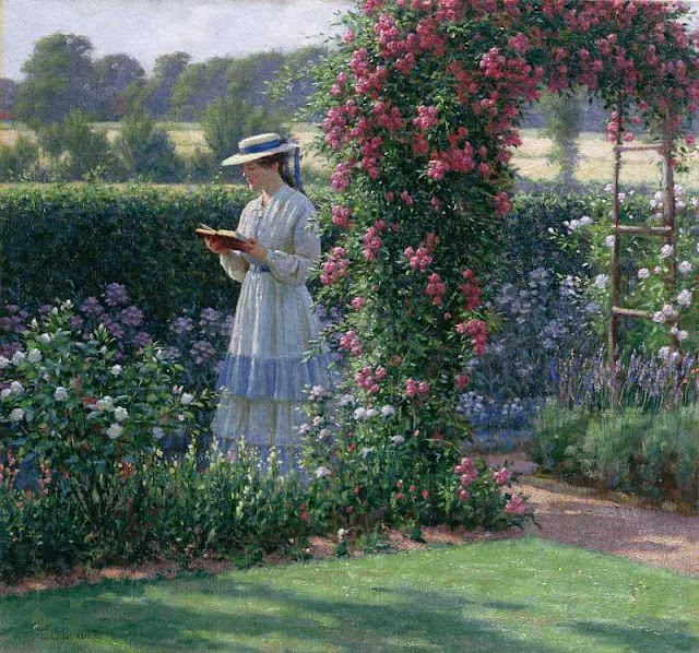
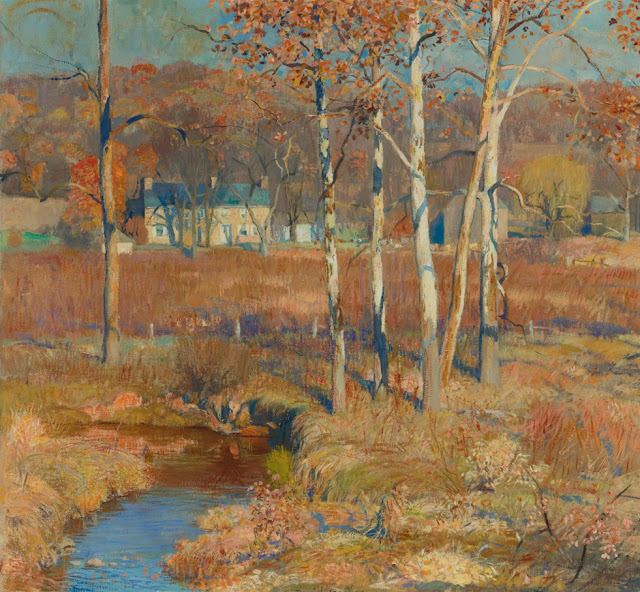
Quantcast
Channel: Underpaintings
Viewing all 214 articles
Browse latest View live

Evert Ploeg at the Elm Street Theatre - One Night Only

$
0
0


Portrait artist Evert Ploeg will be participating in a live multimedia stage event, tomorrow, April 29th, at the Elm Street Theater in Woodstock, Georgia.  During the show, Ploeg will paint a portrait from life of acclaimed actor Kurt Sutton, as Sutton performs scenes from his one-man show "An Evening with Mark Twain."  Ploeg, a member of the 2013 Art of the Portrait faculty and the "Best of Show" award winner of the 2011 International Portrait Competition sponsored by the Portrait Society of America, has performed similar feats onstage in his native Australia as actors moved about him.

The Elm Street Theater is located at 8534 Main Street in Woodstock, Georgia.  The show runs from 7:00 - 10:00 PM (doors open at 6:30 PM).  Tickets are $40, and can be purchased online at elmstreetarts.org.  For more information, please call the the theater at 678.494.4251. This is a one-night only performance, so do not miss it!

Proceeds from the event will benefit the New Elm Street Cultural Arts Village.


Evert Ploeg at the 2013 Art of the Portrait Face-Off Demenstration

Proudly sponsored by the Elm Street Cultural Arts Village and by Kristina Laurendi Havens of Studio 81.


Random Inspiration: Norman Rockwell

$
0
0

The Art Critic


There is much to be inspired by in the works of Norman Rockwell.  His skills as a painter were prodigious, and as a storyteller, he has yet to be surpassed.  And despite some Modern critics who dismiss Rockwell as merely an illustrator, and deride his works as saccharine and kitsch, he is likely the most universally admired American artist of the 20th century.  So influential were his images, that they became idiomatic of an idyllic United States, one that many still believe in, and one that many still try to recreate.

But Rockwell's talents as both a painter and a narrator can sometimes obscure an underlying trait which he possessed and which deserves just as much recognition as his other skills;  Rockwell was a hard worker.  It may sometimes seem like everything came naturally to Rockwell, but the ease with which he appeared to create his works was the result of years of drawing and painting practice, and a healthy dose of preparation before starting each canvas.  "When I am working on a story-telling picture, every detail must be planned in advance," said the artist in his self-tilted instructional book Rockwell on Rockwell.  "I have to work everything out the hard way."¹ This is perhaps why he was fond of the Thomas Carlyle quote, "Genius is an infinite capacity for taking pains."² 

As can be seen by the following photos of Rockwell's preparatory work for his painting, "The Art Critic," (1955), no effort was too great for the artist.


Rockwell's taboret (from Rockwell on Rockwell)


Rockwell typically followed the same procedure each time he created one of his narrative works. These steps were: 1. Getting the Picture Idea, 2. Selecting the Model, 3. Doing Research and Collecting Props, 4. Posing and Photographing the Model, 5. Executing the Charcoal Sketch, 6. Creating the Painted Sketch, and 7. Completing the Final Painting.³  Though Rockwell considered each of these stages leading up to the final picture essential, it was step 5, the charcoal layout sketch, which he felt was most important⁴, as it provided the real foundation of the painting.


"It is in the charcoal drawing that I start with the first rough sketch and, with the help of photographs of models and props, completely develop the story and solve, to the best of my ability, all the problems of drawing, composition, and tone -  in fact every problem but that of color."⁵

To Rockwell, the imagination played a very significant role in developing the picture idea, and in selecting and arranging the details, but it had no place in the execution of the final painting.  Every single object appearing in the painting, Rockwell felt, had to contribute to the central theme of the picture,⁶ and therefore each object had to be well-drawn;  these objects could not be guessed at in the final stage.  "Never try to fake something if you can get the object and paint from it," said Rockwell. "When you know all about your subject by having done thorough research or, in the case of props, when you have them right in front of you, your picture will have the unmistakable stamp of authenticity and sincerity which it would lack otherwise."⁷ This also included the broader backgrounds, for which Rockwell was willing to travel across the country to experience and document with photographs. 
"When you have decided what the background of your picture is to be, follow just one rule and make no exceptions.  Go to the real thing – the actual background.  Don't try to fake your background or dream one up or use some picture from a magazine as a substitute for the real thing.  Go and find the best possible location embodying the background you have chosen and make sketches and take photographs of it, whether it is an early American kitchen or the inside of a submarine. When you go to the location yourself, you will get the 'feel' and the 'smell' of the background which will in a great measure set the mood for your picture. . . The real background suggests things which you could only imagine, which would never occur to you at all in the studio."⁸
All of this preliminary work would culminate in the creation of the charcoal sketch, to which Rockwell would often devote a week of steady work – longer than he would often take to make the final painting. These sketches were done the same size as the final canvas, and, depending on the subject, were either carried out as a simple line drawing, or, more often than not, done as a full tone drawing (If the subject required little caricature, involved a lot of architectural elements, or Rockwell was simply pressed for time, he would do a contour drawing in charcoal, or sometimes pencil, if the composition was rather small.  The more his drawing diverged from his photo reference, the more likely he was to do a full value drawing in charcoal).  He worked on 42" wide architect's detail paper, which he prepared for accepting charcoal by rubbing the entire surface with a kneaded eraser to remove the manufacturer's sizing.  On this he would then draw using a variety of materials:  Wolff pencils in grades HB or B when tracing projections from his Balopticon, sharpened French charcoal (Fusain Rouget No.2, when available) for tones, and a kneaded eraser for most corrections.  "Do not feel that the time and energy you devote to this important step in picture making is wasted, because it is here, more than in any other part in making a picture, that you can express and develop your ability as a draftsman, your power of composition, your sense of humor or pathos, your ability to make every detail add to the message you want to convey."⁹


Rockwell using the Balopticon while working on "First Trip to the Beauty Shop" (1972)

Considering the number of paintings Rockwell created during his career, it is remarkable that he did so while putting so much effort into each piece.  He did of course make the work easier on himself when possible;  photography and professional photographers certainly sped up his process, as did tracing projected images from a Balopticon, a task he sometimes assigned to a studio assistant (Rockwell would then make changes to his assistant's tracings).  But still, Rockwell's output was significant. Perhaps the lesson another painter should learn from Rockwell's example, though, is more than just working harder - it is a matter of applying that intense labor at the right stage of the picture-making process.  Intense preparation could possibly be the quickest route to a successful painting.

"You should not spare yourself in doing the best work of which you are capable, no matter what this involves." ~ Norman Rockwell ¹⁰


Rockwell working from life, 1925.


Norman Rockwell's painting, "The Art Critic," as well as several other of his iconic works, including "Going and Coming," and "Girl at Mirror" are currently on view at the Crystal Bridges Museum of American Art in Bentonville, Arkansas.  American Chronicles:  The Art of Norman Rockwell, was organized by the Norman Rockwell Museum in Stockbridge, Massachusetts, and includes preliminary sketches, color studies, and photographs of Rockwell working in his studio.  It is on display through May 27th.  For more information, please visit the Crystal Bridges website.


¹ Rockwell, Norman, Rockwell on Rockwell:  How I Make a Picture, (Watson-Guptill Publications, New York, 1979), p. 115.
² Rockwell, p. 114.  Rockwell refers to the quote as, "Genius is the ability to take infinite pains,"though he is uncertain of its attribution.
³ These steps appear to correspond with Rockwell's mid to late career.  At the beginning of his tenure as an illustrator, Rockwell worked exclusively from life, so Step 4 would have not included photography.  The overall methodology would seem to be consistent, however, though how each step was executed certainly varied over the span of career.
⁴ Rockwell, p. 137.  It could be argued that the charcoal layout sketch was of secondary importance, it being subordinate to the picture idea.  "Without a good idea right at the start," said Rockwell, "only failure can result."¹¹
⁵ Rockwell, p. 115.
⁶ ibid., p. 82.
⁷ ibid., p. 114.
⁸ ibid., p. 93.
⁹ ibid., p. 115.
¹⁰ ibid., p. 135.
¹¹ Guptill, Arthur L., Norman Rockwell:  Illustrator, (Watson-Guptill Publications, New York, 1946), p. 195.


2013 International Portrait Competition Awards

$
0
0


WILLIAM F. DRAPER GRAND PRIZE WINNER

Leslie Adams


BEST OF SHOW

Kerry Dunn


FIRST PLACE

Iliya Mirochnik


SECOND PLACE

Serge Marshennikov


FIRST HONORS

Lynn Sanguedolce


HONOR AWARDS

Seth Haverkamp

David Kassan

Cheng Lian

Greg Mortenson

Richard Christian Nelson


EXCEPTIONAL MERIT

T.J. Cunningham

Marina Dieul

Glenn Harrington

Jeffrey Hein

Alicia Ponzio

Mardie Rees

Mary Sauer

Ardith Starostka

Katherine Stone

Jennifer Welty


PEOPLE'S CHOICE

Seth Haverkamp


Sneak Peek: "SELFISH" at Katherine Cone Gallery, Los Angeles

$
0
0

Sean Cheetham  -  Self-Portrait

Sean Cheetham, the California artist and teacher recently named to the list of 25 Artists of Tomorrow in American Artists Magazine's "Greatest Artists of All Time" issue, has just curated a show for the Katherine Cone Gallery in Los Angeles.  That show, SELFISH, features self-portraits from 20 artists who embody the gritty and direct style that has become Southern California's own.  

The Katherine Cone Gallery is located at 2673 S. La Cienega Boulevard, in Los Angeles.  For more information, please contact the gallery at 310.287.1558, or visit their website, www.katherineconegallery.com.  Gallery hours are Tuesday through Saturday, 11:00 AM - 6:00 PM.

SELFISH opens today, and runs through June 22.


Jonathan Hart  -  Red Hand

Jeff Nentrup  -  36

Johnpaul Altamirano  -  AKA Freedom

Hollis Dunlap  -  April Nights

Kevin Llewellyn  -  Fuck Romance

Eric Pedersen  -  Pedersen

EL MAC - Self-Portrait

Natalia Fabia  -  Pearhead

Kate Savage  -  Sita / Springtime

Marc Trujillo  -  2201 Eubank Boulevard

Ryan Cheetham  -  Dick in a Box

Ryan Cheetham  -  Dick in a Box

Wayne Johnson  -  Past, Present, Future

Sergio Sanchez  -  Pull My Finger

Richard Morris  -  Self-Portrait, The Temptation of St. Anthony

Korin Faught  -  Romantic Me

Stephen Schirle  -  SES

Sonya Palencia  -  Zorra

Julio Reyes  -  Self-Portrait

Candice Bohannon Reyes  -  Self-Portrait

Max Ginsburg NYC Workshop July 2013

2013 Art of the Portrait: The Vendor Room

$
0
0

Like kids in a candy store, artists busy sampling treats in the vendor's room (at the Richeson Booth)


At 4:00 PM on April 25th, at the same moment the Art of the Portrait conference officially began, the doors to the Expo Hall opened, and fleet footed attendees ran straight to their favorite vendors to pick up more studio supplies at special conference discount prices.  This year, I made sure I was among the first to enter the vendor's area, and I tried to snap a few pictures before the the aisles became too densely packed with shoppers.  It is during this first hour of the conference, before the Face-Off commences, that the atmosphere in the vending area is the most hectic.

I personally love the vendor's room.  Ordering supplies over the internet does not compare to having the opportunity to examine the different products up close, and to ask questions face-to-face with the passionate people who are responsible for making them.  These are the items we use everyday in the studio to create our best works, after all, and I like to know as much about my materials as possible.  Over the years, I have spoken to many of the sellers who participate in the Art of the Portrait events, and the personal connections I feel with these people have made me even more sure of their products and services.  And that takes a big weight off my shoulders, allowing me to worry only about the quality of my painting, and not about the quality of my tools and materials.

Shopping at the conference does have its drawbacks, however, with the main problem being that it is too easy to spend over your budget once you see all the goodies.  But with the all the discounts and the savings on shipping, it is difficult not feeling justified in making the purchases right on the spot.  


Attendees lining up, waiting for the conference to officially begin.

The vendors present at this year's conference were:


Silver Brush, Ltd.

General Pencil, the book table, and the Jack Richeson booth (l-r)


I knew which sellers were going to be there this year, so I made a list of what I needed, and even allowed my supply of certain materials to run dangerously low, just so I could restock at the conference.  I expected to be a the front of the line Thursday evening, fill my list, and be free from temptation the rest of the weekend. This plan even almost worked - almost.  

I had underestimated the pull of new items, available at the conference, and not yet available in stores or online.  


Husar Frames

The book table

Jack Richeson & Co., Inc.

Martin / F. Weber, Co.

Andrew Yannelli, Director of Education at Studio Incamminati, making final adjustments before
the attendees arrive.

Studio Incamminati's Executive Director Jay Pennie (standing),  and Andrew Yanelli
taking a break during downtime later in the weekend.

Rosemary & Co. Handmade Brushes

Silver Bush Limited boxed artist's sets

Jack Richeson & Co.'s brush display

Within minutes of the doors opening, the vendor room was packed with attendees.

Painting demonstrations in the Richeson booth

Kyle O' Brien of New Wave Art Products helping a customer select a palette.

So when I reached the New Wave Art Products booth intending to purchase another wooden palette - I now have four of these beautiful palettes and use them whenever I work - the appearance of newly manufactured items was too attractive to ignore.  New Wave, a relatively young company run by Keith and Kyle O' Brien of Pennsylvania, has used high quality goods, and positive word of mouth between artists, to grow their company's reputation in a very short time.  Their handmade wooden palettes, once available only directly from the brothers, are now sold in art stores throughout the country, including such places as Dick Blick and Binders.  At the conference, however, available for the first time and not yet in retail stores, were two products generating a lot of interest among attendees.  The first was an ambidextrous palette (the thumb hole features a reversible grommet that can be switched for use by either right or left-handed painters), cut in the same shape as the company's highly popular Highland palette.  This new palette, the Easy Lift Peelable Artist Palette, is made of white plastic, and is less expensive than New Wave's wooden palettes.  It also has the advantage of being both oil paint and acrylic paint friendly - in fact, dried acrylic paint just peels right off.  And the second item which proved quite popular was their new line of neutral grey disposable paper palettes, available as both a rectangular pad, and as a palette pad, which they made in response to artist's demands.  I picked up all three new items, not because I plan on shelving my wooden palettes, but because I thought these were the perfect fit for the needs of my young children who are just begining to paint.

This was a slight deviation from my budget, but I was still pretty much on target.

I then moved on to Silver Brushes, where I purchased the tiny Renaissance Sable Cat's Tongue brushes I enjoy using for detail work, the Tara, Escoda, and HK Holbein booth where I picked up some brush soap and a few a few Escoda brushes to try out, and then onto Rosemary and Co.'s booth, where I restocked on my Masters Choice Long Flatbrushes and also picked up several hog's hair bristle brushes, because I have been feeling more painterly lately, and it is time to lay down more paint.

Check, check, and check.

Next Jack Richeson tempted me with their pastels (they do look like candy laid out so beautifully in their boxes, don't they?), but I resisted - for now.  (But they are already on next year's list).


Rosemary Thompson and her husband, Mark, after setting their booth.

Five minutes later, Rosemary and Mark busily recording customer purchases.

At the Natural Pigments booth, George O' Hanlon discusses his Rublev oil colors,
while Tatiana Zaytseva (in background) helps a customer with Rublev watercolors.


I was doing well, sticking to my resolve of controlling my spending.  That was until I made it to the Natural Pigment booth.

As I have mentioned in earlier posts, my palette consists of paints made primarily by two manufacturers:  Vasari Classic Arttists' Oil Colors, and Natural Pigments' Rublev line of oil paints. Both companies make exceptional paints, and for me, they complement each other very well.  (Vasari was a sponsor of this year's conference, and I hope they some day participate in the vendor's room, though having so many great paints all in one place would probably cause me to pass out and miss most of the conference).  I have almost the entire line of Rublev paints in my studio;  I knew exactly what was depleted, and what four tubes I wanted to purchase at the conference, then I would put away my credit card, which would make my bank sad, but my wife happy.

And here is where I was stupid.  I know George O' Hanlon of Natural Pigments, and George loves making discoveries.  Why I expected to go to his booth and know exactly what he would have stocked and ready for sale is a mystery.  The smart thinker would have known that Natural Pigments will always be expanding their offerings.


I expected to purchase a large tube of lead white, a tube of Roman Black, one of Burnt Cypress Umber, and one of red lead (Minium). That was my list.  But then Tatiana Zaytseva, co-founder of Natural Pigments, pulled out Rublev Orange Ochre oil paint (an until-recently sold-out color) and tubed Genuine Naples Yellow (tubed!), and, I immediately added them to my basket.  And then seeing the Rublev Verona Green Earth and the French Sienna color swatches on Natural Pigments' new wall display convinced me to buy two more items not on my original list.  And next came the Italian Varnish and the  Venetian Medium . . . and well, who could resist?  It is not even that Tania and George are such great salespeople - they are passionate about their products, but they are really just there to answer questions and to offer suggestions based on immediate customer inquiries - it is that their products sell themselves.  The funny thing was, after my buying frenzy, the one item I did not get at the Natural Pigments booth was the large tube of lead white (130 ml);  in previous years, it had not sold well, so only the standard 50ml tube was on hand.  Luckily, Natural Pigments, as well as many of the other vendors who were present, will grant attendees the same conference rates on items ordered online due to selling-out, or, as in this case, not having it at the booth;  I ordered two 130ml tubes of lead white, and had them at my front door within a few days of returning home from the conference.


George O' Hanlon introducing artist David Gluck to the newly-made Rublev color charts,
which offer a comparison of tints made from both lead white and titanium white.

George O' Hanlon is, of course, as much of a draw for me in the exhibit hall as are all the products for sale.  I always enjoy hearing what new chemical formulas and processes George has uncovered, and what he plans to bring to market, though I am so blown away by his knowledge that I often feel, when we are done conversing, that I have just gone through a rigorous college chemistry course.  This year O' Hanlon told me of his success in making white lead, and how he plans to streamline the processing of the pigment using froth flotation tubes.  These tubes allow for the separation of particles, with the desired aspect attaching to air bubbles and floating to the top of the tube where it forms a slurry, while the remainder sinks to the bottom (changing the chemical mixture in the tube can reverse which element adheres to the air bubbles and floats to the top).  He also talked about his new facility and new prospects of preparing pigments from tinctures, including producing a new line of alizarin pigments in a variety of hues, not just crimson.  Potentially coming up for the company is the production of a copal varnish which would rival or exceed the virtues of that once made from now-unobtainable African copal. It would be made using a process which was discovered prior to the 1940s, but which never found a viable market use, until O' Hanlon saw its potential for making a better art product.  And this is only a small glimpse of what George has planned for the rest of this year (I had better take another chemistry class as preparation work before our next meeting at the 2014 conference).


Ryan Brown doing a portrait demonstration at the Natural Pigments booth.


Patrons lining up at the registers to pay for their purchases.

Just some of the goodies I brought home from the conference.


Marvin Mattelson June 2013 Workshops

$
0
0

Marvin Mattelson
Jen & Pat
oil on linen
40 X 44 in.
Finalist in the Figurative Category at the 2012-2013 Art Renewal Center Salon


click on flyer to see it larger


2013 Art of the Portrait: Day 1

$
0
0

Michael Shane Neal


During the four-day Art of the Portrait Conferences, it is always Friday which features the most jam-packed schedule.  I had never really appreciated just how full the itinerary was until a few years ago when the Portrait Society of America granted me fuller access to all of the daily events, and I grew exhausted while frantically trying to document everything that was happening during the day.  This year, if it was at all possible, seemed to have more activities on the agenda than had any other conference Friday I can remember.

At 8:30 AM (or, as the jet-lagged, West Coast artists who staggered downstairs called it, "Zero Dark Thirty"), the 15th Annual Art of the Portrait Conference officially welcomed its guests to Atlanta.  This was only the second time the conference was held in the ATL, and just like that last time two years ago, all previous attendance records were broken.  Portraiture is certainly alive and well in the South.

Following the traditional overview film by Tony Pro - in which the faculty, finalists, and the winners of the awards of Exceptional Merit were announced - emcee Michael Shane Neal, who had been standing in for Edward Jonas, left the podium so he could stand-in for Rose Frantzen during the first demonstration of the day.  Frantzen, whose paintings and presence onstage have made her a perennial favorite, unfortunately had to cancel her appearance at the conference this year.  (Our thoughts and good wishes are with you, Rose).  As could be expected of a man with such sartorial style, Neal took to "wearing many hats" with grace, and by the time he made it to mid-stage, he was already in his painting jacket and ready to go.

Neal was joined on the main stage by artist Mary Whyte for a program called "Oil and Water," during which the two each painted a portrait in their respective medium of mastery;  Neal in oil, and Whyte in watercolor.  With their complementary quick wit, intelligence, and charm, Whyte and Neal made for a perfect pairing, and kept the audience entertained for the entire program.  Fellow portrait artist, Sam Adoquei, who did an excellent job sitting for the demonstration, likely had the hardest job of the three on the dais;  not only did Adoquei have to sit with his eyes half-closed for the two-hour pose, he also had to do so in the midst of his colleagues' playful and humorous banter.

After a short break, the next presenter to step up to the podium was James Gurney, a brilliant man who has applied his skills variously to illustration, animation, writing, sculpting, science, blogging, plein air painting, . . . the list just goes on and on.  This year marked Gurney's first participation with the Art of the Portrait convention, and his many fans were eager to hear his stories about "Portable Portraits" - the portrait sketches Gurney has made on a regular basis during his worldwide travels.  Since publication of his popular Dinotopia books, Gurney has been in demand as a lecturer, and his abilities as a practiced speaker were in high evidence during his discourse.  Everyone left the ballroom inspired, and possibly a little ashamed that they were not making as good a use of their sketchbooks as Gurney was of his own.

From 12:15 to 2:00 PM, attendees had an open lunch period, but grabbing a meal was only one of the options available.  Professional portrait artists and portrait agents were on hand in the foyer to offer critiques and advice to attendees wishing to share their portfolios, and the authors of many of the art books available for purchase in the vendor's room were present to inscribe and sign their books.  Fortunately, the hotel provided bag lunches for purchase so that attendees could make the most of the time allotted for this break.

In the afternoon, attendees were invited to build their own schedule through a curriculum of "Breakout Sessions" in which, by prior registration, they could choose which of five programs would best suit their needs.  The first program took place on the main stage, and offered a two-hour painting demonstration and Q&A with Michelle Dunaway and David Kassan.  Program two featured a discussion with James Gurney, Bart Lindstrom, Michael Shane Neal, and Mary Whyte on the topic of "Building a Reputation through Social Media." The four discussed how the internet keeps them connected to their fans, and to potential clients.  "The Natural Evolution of Two Painters," the third program offered, featured slide shows and lectures by two very highly-respected artists who joined the faculty for the first time this year:  Quang Ho and Daniel Sprick.  Through visual examples, Ho and Sprick explained what inspires them in their work, and what humbles them and keeps them creating.  In the fourth option, "Turning My Worst Commission Experience into My Best," artists Sam Adoquei, Evert Ploeg, Glenn Harrington, and Lynn Sanguedolce shared stories about paintings which did not necessarily have inauspicious starts, but which ended in challenges that no one had anticipated when the work began.  In the final program choice, some lucky few attendees were able to participate in a drawing workshop led by Sherrie McGraw and Judith Carducci.  By necessity, this program was limited to a small class size, but those fortunate enough to secure a spot in the workshop were able to draw from live models while under the constant guidance of these two powerhouses of draftsmanship.  Deciding which one of these programs to attend was far from an easy choice for the attendees.

When the "Breakout Sessions" ended at 4:00 PM, guests were faced with new options throughout the hotel.  The ambassadors to the Portrait Society of America were congregated on the outdoor terrace, making themselves available so that Portrait Society members both old and new could meet with their representatives and discuss what was on the upcoming agendas for each state.  For those so inspired by the day's programs that they could not wait to return to their studios to start working, models were provided free of charge for an hour-and-a-half of open drawing time.  In the library, where the 20 works of art eligible for the William F. Draper Grand Prize Award were on display, attendees were invited to stop by to meet the finalists and to discuss their paintings or sculptures.  And for those hoping to use the break to get some more shopping done, and perhaps a little relaxing too, the vendor's room was open, as was a cash bar outside the main ballroom.

But those who had attended previous Art of the Portrait conferences knew what was coming at 5:30 PM, and may have spent that last hour-and-a-half preparing both mentally and physically for the 6X9 Limited Size - Unlimited Talent Mystery Sale.  During this special biannual auction, dozens of temporarily unattributed 6 by 9 inch paintings (or similarly-sized sculptures) by many of today's most talented artists are sold for a flat rate of $250 each.  It is thrilling and exciting, and sometimes terrifying, but for the persons who obtain a painting, it can make their year.  This was only the third time this event has taken place, but it has been a resounding success.  Hopefully, if it continues into the future, the auction will become a bit more regimented;  as it is right now, when the bell rings to start the bidding, the room becomes a madhouse.  (Of course, this may also be the sour grapes of a person who has failed in his three attempts to get the paintings he wanted).

When the 6x9 auction ended, there was only one official event left - the auction of the painting sketches from Thursday night's Face Off.  Throughout the day, those paintings were on display in the hallway outside the grand ballroom.  Attendees had the opportunity to examine the paintings closely, and to vote for one of the artists to be a demonstrator on Saturday morning.  They also had the opportunity to bid on those Face-Off paintings on an attached bid sheet.  At 6:15, the final bids were placed, and some lucky collectors went home with some terrific original artworks.

With all of the official events of the day finally over, it was time for everyone to grab dinner at the hotel, or at one of the excellent restaurants nearby.  Afterwards, many of the artists gathered in the hotel's lounge to relax and socialize, but only a hardy few stayed up past midnight.  Saturday's schedule was also rather full, and the morning would be there before we all knew it.


Michael Shane Neal donned his painting jacket, and prepared to begin his demonstration.

Minutes after Neal reached his easel, Mary Whyte claimed to be nearly finished with her portrait;
Neal was peeking at Whyte's drawing, just to make sure she was joking.


Sam Adoquei


Portrait of Sam Adoquei  -  Mary Whyte

Portrait of Sam Adoquei  -  Michael Shane Neal

James Gurney

Gurney related stories of learning just enough language in a foreign country to ask locals to sit for him.

In his twenties, Gurney travelled with his college roommate, Thomas Kinkade,
making sketches of people and places across America.  The results were published
in the book,  The Artist's Guide to Sketching.

Sometimes Gurney introduces fantasy into his observational sketches.  On the left, he imagined a fellow-traveller
in an airport as a leprechaun waiting for  a mysterious hidden transport system of which only magical creatures
are aware.  On the right, he drew a city street scene, but left the center blank.  He added the cat back in his
hotel room while dreaming of a city gridlocked by giant animals sleeping in the city streets.


Ed Jonas sending the audience off on their lunch break.

(l-r) James Gurney, Bart Lindstrom, Michael Shane Neal, and Mary Whyte

Neal discussing how he needs special dispensation to put images of his governmental portraits online.

Quang Ho thinks in terms of the very big, and the very small.  His representational paintings are made up of hundreds of tiny abstract works, and he feels that each of his brushstrokes should tell a story.

Daniel Sprick discusses his choice of setting his figures against a bright white backdrop.

Evert Ploeg

Glenn Harrington was inspired to add flowers to the hair of a commissioned portrait, and liked the resulting
painting so much, he decided to start a new painting for his client, and keep the original.

Michelle Dunaway and David Kassan painting Mia Bergeron


Squint!


When the demonstrations conclude, the paintings are displayed to the side of the main stage so that the
audience may take a closer look.  Often the faculty will bring in other examples of their finished work to
share with attendees.


Sherrie McGraw


Judy Carducci


Examining the finalists in the library.


Kerry Dunn (left) in mid-conversation with fellow-finalist T.J. Cunningham

Serge Marshennikov - In the Twilight (detail)

Leslie Adams speaking with Richard Broderick

Katherine Stone

Marina Dieul

Alicia Ponzio - Irving (detail)

Seth Haverkamp

Glenn Harrington

David Kassan - Letter to My Mother (detail)

Letter to My Mother (detail)

Cheng Lian

Jeffrey Hein

Jennifer Welty speaking to Jonathan Linton

Jennifer Welty - Will (detail)

Mary Sauer and Gary Haynes

Ardith Starostka

Richard Christian Nelson (center)

Richard Christian Nelson - Luke at 15 (detail)


Bart Lindstrom (standing) checking in with Florida's Ambassador to the Portrait Society of America

Open drawing session in the Azalea Room

Alexandra Tyng

Face-Off paintings are on display until Friday evening, when they are auctioned off.

Attendees have until 4 PM on Friday to vote for which Face-Off painter they think should give a
demonstration on the main stage Saturday morning.

Crowds gather in the ballroom to examine the 6X9 works before the auction.

Sherrie McGraw

Alexandra Tyng

Stephen Early

Mary Whyte

Richard Broderick

Ann Manry Kenyon

William Bartlett

Vasudeo Kamuth

Matthew Innis

Marina Dieul

Jason Bouldin

Holly Metzger

John Michael Carter

Carol Arnold

Lea Colie Wight

James Tennison

The bell sounds, and the madness begins. . .

Bidding on Sherrie McGraw's still life.

Annie Kraft Walker with her purchase, painted by Aaron Westerberg  

Evert Ploeg with a painting by Rob Liberace

(l-r) David Gluck, Kate Stone, Jeff Hein, and Ursula Toelke
After finding out he was picked to demonstrate Saturday morning, Hein asked Stone to be his model.

Joseph Todorovitch posing with the lucky person
who purchased his Face-Off painting.

Unwinding at the end of a long day:  (l-r)  Sam Adoquei, Osiris Rain, Alexandra Tyng,
Linda Tracey Brandon, and David Kassan


2013 Art of the Portrait: The Weekend in 5 Minutes

$
0
0


If you were at the 15th Annual Art of the Portrait Conference in Georgia last month, then you probably three of us porting around cameras all weekend long;  chances are, we stepped right in front of you as we were grabbing some shots at the event.  The three of us, Garth Herrick, David Sauer, and myself, are busy going through our images of the weekend, and doing our best to share them.  In this slideshow video, Herrick has put together a portion of his nearly 6,000 photographs from the conference, and if it feels like it all goes by in a blur, then you know what it felt like to actually be there.

Thanks, Garth!  You captured some really amazing photographs!


Auction Preview: Sotheby's London19th Century European Art

$
0
0

Joaquín Sorolla (Spanish 1863-1923)
Niños en la playa, Valencia
27.5 X 39.5 in.
oil on canvas


In the 19th century, Paris is where artists went to train, but it was in London where they went to sell.  Today if you are a collector looking to buy or sell work created in 19th century Europe, London, however, is no longer the first choice;  New York City is where much of the high-end 19th century art is now put at auction.  But London art sales are not without their charms.  Reserving their own country's artworks for sales dedicated to British artists, London's contemporary sales of 19th century art often feature a broader and more cosmopolitan selection of artists from the European mainland than would be seen in the United States.  Usually, though, the biggest (non-British) names now seem reserved for the American market.

An exception to this appears to be the renowned Spanish impressionist, Joaquín Sorolla y Bastida, one of whose paintings, Niños en la playa, Valencia, is currently listed in Sotheby's upcoming sale of 19th Century European Paintings.  Though Sorolla's works have appeared in American auctions, his most beautiful and iconic paintings - like this one - are directed to a European audience (This does not mean that the auction houses do not try to entice American buyers;  I have seen works by Sorolla flown to New York for viewing before being flown back to London for sale, which likely happened with this work too).

Niños en la playa, Valencia, is, without doubt, the most exciting lot in Sotheby's upcoming sale.  It is from the collection of the artist's granddaughter, Blanca Pons-Sorolla, and is featured on page 173 of her recently-published book, Sorolla: The Masterworks (though the colors of the online image are much better than those which appear in the book).  The painting, from a brilliant and highly-collectible period in Sorolla's career when he focussed on seaside, candid portraits of his own children, is expected to fetch between 1,800,000 and 2,500,000 British Pounds (between 2.7 and 3.8 million USD).

Sotheby's auction of 19th Century European Paintings will take place on May 23rd in London.  Previews begin tomorrow, May 19th, and run through the 22nd.  The catalog is also available online, and can be downloaded via the Sotheby's iPad app in the Apple iTunes store.

London Exhibition

Sunday May 19th  |  12:00 PM - 5:00 PM
Monday May 20th  |  9:00 AM - 4:30 PM
Tuesday May 21st  |  9:00 AM - 4:30 PM
Wednesday May 22nd  |  9:00 AM - 4:30 PM


Joaquín Sorolla (Spanish 1863-1923)
En la playa
12.5 X 16.25 in.
oil on board

Ignacio Zuloaga (Spanish, 1870-1945)
Dama con mantilla y abanico
37.5 X 25.5 in.
oil on canvas

Conrad Kiesel (German, 1846-1921)
Daydreams
24.75 X 15.5 in.
oil on canvas

Olga Wisinger-Florian (Austrian, 1844-1926)
Herbstlaub
30.25 X 20.5 in.
oil on canvas

Albert Edelfelt (Finnish, 1854-1905)
The Boy's Workhouse, Helsinki
17.25 X 21.75 in.
oil on canvas

Vilhelm Hammershøi (Danish, 1864-1916)
Ida in an Interior with Piano
23.5 X 21.75 in.
oil on canvas

Vilhelm Hammershøi (Danish, 1864-1916)
Interior with Stove
26.5 X 22 in.
oil on canvas

Peder Mønsted (Danish, 1859-1941)
Children by a Stream
28 X 39.5 in.
oil on canvas

Victor Huguet (French, 1835-1902)
Caravane dans le désert
25.5 X 36.25 in.
oil on canvas

Joaquín Agrasot (Spanish, 1837-1919)
An Arab Man
33.25 X 17.5 in.
oil on canvas

Adam Styka (Polish, 1890-1959)
On the Banks of the Nile
17.5 X 21 in.
oil on board

Vittorio Reggianini (Italian, 1858-1938)
The Recital
21.5 X 29.5 in.
oil on canvas

Michael Zeno Diemer (German, 1867-1939)
View of the Bosphorus with Rumelihisari
32.5 X 43.5 in.
oil on canvas


Auction Preview: Bonham's New YorkAmerican Art May 22nd

$
0
0

Henry Pember Smith (1854-1907)
Country Cottage by a Pond
25.25 X 35.25 in.
oil on canvas

Now in previews in New York City is Bonham's Auction 20553, American Art.  It is a small sale with fewer than 100 pieces, but for those able to make it into the showroom, it is a chance to see several museum quality works up close, and in a non-museum setting.  For those who cannot visit the showroom, all of the lots in the sale all also viewable online.

Bonham's New York City facility is located at 580 Madison Avenue.  The auction of American Art will take place on May 22nd, beginning at 2:00 PM.  Preview times and dates are as follows:

May 19th  |  12:00 - 5:00
May 20th  |  10:00 - 5:00
May 21st  |  10:00 - 5:00
May 22nd  |  10:00 - 2:00


Harriet Randall Lumis (1870-1953)
Haystacks Along the Connecticut
18 X 24 in.
oil on canvas

Richard Lorenz (1858-1915)
The Herders
22 X 30 in.
oil on canvas

Daniel Ridgway Knight (1839-1924)
La Vendange (1879)
33.75 X 43.75 in.
oil on canvas

John Singer Sargent (1856-1925)
Portrait of Mrs. Hardt (1904)
24 X 19 in.
charcoal on paper

Colin Campbell Cooper (1856-1937)
The Flapper Girl (1916)
27 X 20 in.
oil on canvas

Alice Schille
Mother and Son (c. 1910-15)
42 X 32 in.
oil on canvas

Walter Launt Palmer (1854-1932)
Path Through the Snow Under Golden Skies
30 X 18 in.
oil on canvas

George William Sotter (1879-1953)
Homestead at Night
22 X 26 in.
oil on hardboard


Auction Preview: Sotheby's New York American Art

$
0
0

Maxfield Parrish (1870-1966)
Prometheus (1919)
31 X 21.25 in.
oil on panel

There is still time to catch the previews of Sotheby's New York auction of American Art before the lots go to bid on the Wednesday, May 22nd.  Included in the sale are a variety of genres from the 19th and 20th centuries including Western Art, illustration, American Impressionism, and the Hudson River School.  The centerpiece of the sale, however, is a Gilded Age piece from John Singer Sargent, called Marionettes (Behind the Curtain);  it is expected to bring between $5 and $7 million when the bidding ends.

Sotheby's New York City auction house is located at 1334 York Avenue.  Previews are, as always, free and open to the public.  The online catalog can be viewed here.

Exhibition in New York

May 18th  |  10:00 AM - 5:00 PM
May 19th  |  1:00 PM - 5:00 PM
May 20th  |  10:00 AM - 5:00 PM
May 21st  |  10:00 AM - 1:00 PM


Maxfield Parrish (1870-1966)
Wynken, Blynken, and Nod (1902)
21 X 14.75 in.
oil on paper

Norman Rockwell (1894-1978)
Doc Mellhorn and the Pearly Gates
'He was just a good doctor and he knew us inside out.'
26.25 X 21.5 in.
oil on canvas

Norman Rockwell (1894-1978)
Study for "Construction Crew" (1954)
17.5 X 16.33 in.
pencil on paper

Norman Rockwell (1894-1978)
The Veterinarian (1961)
21 X 20 in.
oil on canvas

Frederic Remington (1861-1909)
The Advance (Guns Must be Delivered) (c. 1902)
27 X 40.25 in.
oil on canvas

William Keith (1839-1911)
Yosemite Valley (1876)
48.25 X 80.25 in.
oil on canvas

Alfred Thompson Bricher (1837-1908)
Indian Summer, Massachusetts
22 X 36 in.
oil on canvas

George Inness (1825-1894)
Near Perugia (1872)
72 X 54 in.
oil on canvas

Frank Weston Benson (1862-1951)
After Sunset (Long Point Sunset) (1923)
50 X 40 in.
oil on canvas

Granville Redmond (1871-1935)
Carmel Coast (c. 1920)
30 X 40 in.
oil on canvas

Daniel Garber (1880-1958)
November (1931)
28 X 30 in.
oil on canvas

Andrew Wyeth (1917-2009)
Elsie's House
20 X 28 in.
watercolor and pencil on paper

John Singer Sargent (1856-1925)
Portrait of Quincy Adams Shaw, Jr. (1896-1987) (1917)
24.5 X 19 in.
charcoal on paper

John Singer Sargent (1856-1925)
Marionettes (Behind the Curtain) (1903)
29 X 20.875 in.
oil on canvas

Nicolai Fechin (1881-1955)
At Home in New York (1924)
18 X 24 in.
oil on canvas laid down on board


Words of Wisdom: Michel Jacobs on Portrait Painting

$
0
0

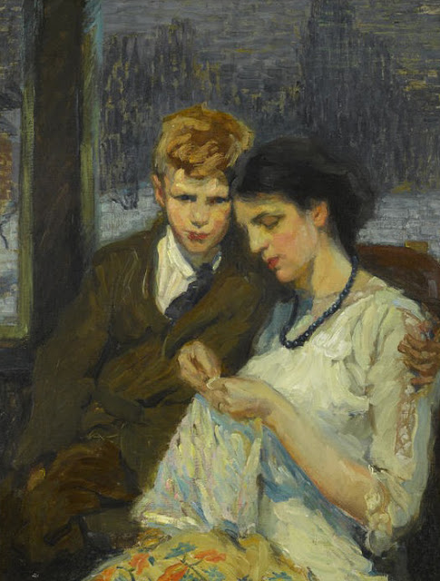
Michel Jacobs   -  My Last Duchess


Michel Jacobs is not the most familiar figure in 20th century portrait painting, and it is not too surprising.  Despite some important commissions, a prominent position in the military as an expert on maps, color, and camouflage, and his role as founder of the Metropolitan Art School of New York, Jacobs was, at best, a good representative of a mediocre period in portraiture.  At worst, he was a mediocre example from a bad period.  His pedigree, however, was remarkable.

Born in Canada in 1877, Jacobs received art training at several prestigious schools in Europe and North America.  His earliest study took place in the United States, at the National Academy in New York.  From there, he travelled to Paris, where he trained at the Académie Julian, and at the École des Beaux-Arts in the atelier of Jean-Paul Laurens.  And when he returned to the United States, he aimed to share that knowledge with his American students through his own school and through a series of books on color, composition, and portrait painting.

In reading Jacobs' books, it is nice to think of them as a being a bridge between 19th century training and the present;  that somehow Jacobs carried the banner of representational art through the miasma of 20th century disdain for the genre.  But it is difficult to feel that way after reading some of his work.  Jacobs seems to have been searching for answers as much as are the people who can only dream of the training he had.  Some of his theories, specifically on color, were peculiar, and some of his discoveries as a teacher seem obvious, and it questionable that some of the methods he claims as his own were not actually part of his training - unless the schools which trained him had already deteriorated a considerable amount by the time he walked their halls.

Michel Jacobs is, nonetheless, deserving of appreciation.  Though there are better art instruction books available - many of which were written prior to those by Jacobs - anytime a teacher or student records their lessons, it is valuable to subsequent generations of artists.  It is up to the contemporary student to discern which lessons are most valuable.

Below is some of Jacobs' more salient advice.
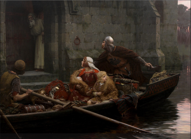


Jacobs advocated a three-color primary system of red, green, and (blue-) violet.  His color circle involved additive colors integrated into a subtractive framework.¹

To reproduce his 24 color spectrum, Jacobs recommended the following colors:  Cadmium Red, Cadmium Orange, Cadmium Yellow Pale, Emeraude Green, Cobalt Blue, Cobalt Violet, Alizarin Crimson, and Zinc White.


Before you can become a portrait painter, it is necessary to learn thoroughly the technique used to make a portrait.  This technique includes a thorough mastery of drawing, composition, colour mixing, and colour combinations.  It is necessary also for a good portrait painter to understand the anatomy of the figure and have a thorough knowledge of the muscles and bones of the face, head, and hands.  Important, too, is the study and use of perspective, and the study of textiles and how to paint them.

Portrait painting is both a science and an art.  To be a portrait painter, whose name will go down through the ages, it is necessary to study fundamental principles, otherwise, the work will have no value, but will be just a photographic image "to please the family."

A portrait is not merely a photographic likeness of the sitter, but rather an interpretation by the artist of character and soul.

. . . the artist who uses his eye instead of the camera, must . . . be a good judge of character and select the characteristic expressions of the face, whereas, a camera takes only the accidental momentary flash.

A certain amount of memory painting is necessary, especially with children.  Very often much of the work done by the artist is executed after the sitter leaves the studio.

. . . under no circumstances paint in the eyes until the head has solidity, form, and likeness.  If you paint in the eyes before the portrait is there, you are very apt to ignore the forms which go to make up a solid head.

Work on the head should be almost completed before the eyes are put in.

The old method of using colour of the background to mix with all shadows only gives us a picture in monochrome.  If one wishes to paint the colours of nature with all the wonderful effects that it has on our eyes one must study colour.

The portraitist must be, first of all, a good draftsman so that he is not afraid to lose his drawing while painting, and he must be able to see colour and know how to apply what he sees.

To attempt to give the colour of any object in an arbitrary way is impossible.  If the painter studies still life and flowers, he will have no trouble in giving to his portraits the "light of life" and he will no longer paint "leather flesh and wooden hair."

It becomes the work of the portraitist to find the real character and to portray the best that is in the sitter. The costume should be appropriate to the character.  The background and accessories carefully chosen. All contribute to a beautiful work of art.

The costume and the accessories should not be the focal point of interest.  The onlooker must be drawn to the face . . .

In starting the portrait (of a woman), it is very necessary that all cosmetics, rouge, powder, etc., be removed so that the artist can really discern the character of the person, to be able to paint the anatomy and plans of the face.  When powder is used, it hides the texture of the skin;  lipstick changes the form and planes and expression of the mouth.  However, in the last sitting, it is a good idea to allow the lady to put on her "war paint" so that the artist can see how much colouring she likes to have even though artificial.

It is well for the artist to carry on a conversation with the sitter.  If he keeps his own youthful enthusiasm, he will portray it in the portrait.  Find a subject in which the sitter is most interested and talk on that subject.

To get a really good portrait of a woman, the sitter has as much to do with it as the artist.  Above all, keep your sitters' interest and do not tire them.  Two hours posing with short rests every half hour is adequate.

To get an interesting portrait, it is essential for you to almost fall in love with the sitter.  Rubens always told his pupils that they must fall in love with anyone they painted to get the indescribable something.  The portrait not only must be a painting and a work of art:  it must be a living thing.  John Ruskin wrote, "When love and skill work together, expect a masterpiece."

In painting a man, the modeling and construction of the head is much more definite, more easily seen.

Frans Hals painted his men with a great deal of directness but his women, especially the young ones, with more finish and smoothness.

In a man's head rougher paint is much more interesting and gives the texture of a man's skin.

Children are even more difficult to paint than women, primarily because so few of them really "pose." Here memory painting is very necessary.

We know from our study of anatomy, that a child's head is not in the same proportion as the grown-up's.  Take for instance a child of one year old.  The body is four heads;  at three years, five heads;  at ten, six heads;  at fifteen, only seven heads.  A man's or woman's body ranges from seven to eight heads.  Then again, the proportions of the eyes, nose, mouth, and ears are entirely different.  The distance between the eyes in a child is much closer than in the grown-up.  However, bear in mind that a child's eye, that is the eyeball, never grows after birth.†  This is the only part of the whole body that does not change in size.  That is why a child's eye always appears bigger in proportion.  The muscles and flesh around the eyes change with the years.  The ear also changes in size and very often in shape.  The nose in a child is very seldom developed and generally is a little stubbed.  The length of the nose is very much shorter than in a mature person.

There is a certain roundness of the child's head and when very young could almost be fitted into a square, whereas the adults (sic) would be more oblong.

Do not place too much definite modeling in the head of a child.  While the cheeks are almost round like a balloon, if you look closely, you will find that the muscles around the eyes, near the cheeks, show a little modeling.

. . . all shadows should be kept soft so as to give the texture and softness of a baby's skin.

The face of a child is comparatively small in relation to the head.  It is about one-quarter of the head, from the place where the eyebrows would be to the chin.  The ears are small, generally placed about the middle of the head.

The upper eyelid is formed of three planes depending on the position of iris and the turn of the head.  The upper lid above the iris, no matter what position the eye is turned, is more or less flat.

The iris of the eye should not be painted in until the surroundings of the eye are first painted.

My old master Jean-Paul Laurens, at the École des Beaux Arts in Paris, said, "You must paint an ear so that you can pull on it."

But remember that the ear like every other part of the head, must be drawn in perspective;  otherwise it will throw the entire head out of drawing.

Hair is a metallic surface whether red like copper, blond like gold, brown like bronze, light brown which is light bronze, black which is dark bronze, or white which is silver.  It is well to paint the hair so that the paint flows easily on the brush by using a great deal of medium.  The shadows are put in first, then the halftones, then the lights, all while wet.  A good way to get the effect of light on hair, especially the highlights, is to paint the strokes across the light instead of the direction of the hair.  Then, while still wet, use a large dry brush and drag the paint across.  This will give the texture of the hair.

Study anatomy and express it in the neck and shoulders.  Be careful, however, not to make the shadows as dark as they appear in life.  Remember, the head is the principal part of a portrait.

The muscle that runs from the pit of the neck to the back of the ear, called the sternomastoid muscle, generally shows quite strongly in a woman, no matter how swan-like or soft her neck may be, especially if she turns her head.  This muscle should be painted and expressed in a mild form, being careful of the hollow formed by this muscle against the collar bone.  It is bounded toward the back by the muscle that has three points of attachment called the trapezius.  One point of attachment shows in the front on the upper part of the neck.

The neck is not a straight column or cylinder mounted on the shoulders.  It has beautiful curves.

All of these muscles and even the "Adam's apple" should be expressed but not too forcibly.  Keep the shadows light, the edges soft, and the light a little darker.

A portrait painter must have a thorough knowledge of the anatomy of the hands.  They are difficult to paint.  They express different emotions without subterfuge.

With all the details that are necessary to paint the hands, the whole whole construction should be soft and flowing, yet show a certain amount of anatomy.  But what is more important, the expression in the hands should denote the character of the sitter.

The arm must "flow" into the hand.

. . . fingers are not round but have four sides.

Many people, in looking at a portrait, judge its artistic value by how well the hands are painted.

The end of the fingers are slightly rosier than the rest of the hand.

In lighting a woman's head, have the light fairly low.  In a man's head the high skylight or high side light will cast a shadow in the eye socket, under the nose and under the chin and bring out more forcibly the strong lines of a man's head.  In a woman's head it is good to keep these shadows softened and a fairly low light will do this.

At times a large piece of white paper or cloth stretched on a canvas stretcher may be so placed to reflect light into the shadows, making the lighting effect more interesting.

If you desire a firelight effect in the face, place a large highly polished copper tray or brass tray to reflect up into the face.  In this case, remember that the shadow side and halftones of the head will be much colder than in painting from the ordinary north light on account of the simultaneous contrast.  To get the effect of light in just the colour of firelight, one must keep the rest of the head cold.

Sometimes it is desired to get a starling effect by painting complementaries;  that is, the drapery (i.e. the costume and accessories, and all textiles in a portrait) in complementary colours of the background.  As a rule it is better to have the whole picture in harmony.  It makes a more livable picture.

The background must have atmosphere.  There are many ways to arrive at this.  One method is to break up the colours into their component parts.  For example, take a green background.  As green is made with yellow and blue, paint in the approximate colouring of the background green in the shade and value, using a little poppy oil as the medium.  Then break into this with a little blue and yellow, working it into the wet paint.  White, of course, will be used in mixing the colours and the correct shade of green neutralized as necessary by means of its complementary.

The head must always stand in front of your drapery (i.e. a fabric backdrop).  This can be arrived at by not painting the shadows too dark or the lights too light. . .

The brush used (for painting backgrounds) should be very large, as large as your intelligence allows.

Do not have the paint too thick in the background.

You must be able to feel that you could walk around the figure.  Therefore, the background should be simpler as it approaches the head.

If chairs, desks, or other furniture are to be portrayed, the shadows should be a little lighter and the lights a little darker than in reality.  This will hold the accessories in their proper place, and they will not intrude themselves as the first things seen.

Yellow gold is painted by first painting the dark or shadow side in either neutralized red or neutralized orange.  The halftone is painted with a yellow-orange or yellow slightly neutralized, the refracted light in yellow-green or green.  The highlight is generally yellow with white added.  This gives a sparkle and metallic surface.

. . . great care has to be taken that in the last sitting you do not ruin a good portrait by following al the suggestions and criticisms of the family and friends.  There are many people who pose as a judge of art, but who knows nothing about painting.  They have built up a reputation among friends as "a great critic," and have spoiled many a good portrait when the artist was foolish enough to listen.

These suggestions give you an idea of how to see, for it is a bad idea to use a formula without using your eyes.


The human eye actually does grow after birth, though most of the growth is along the "axial length" (front to back).  In relation to other parts of the body, the eye appears to grow very little over the years of a person's physical development.


¹Colorsystem: Michel Jacobs, retrieved May 23, 2013 from [www.colorsystem.com/?page_id=868&lang=en].


Bibliography

Jacobs, Michel, Colour in Portrait Painting, (D.M. Campana Art Co., Inc., Chicago, 1957).


Workshop: David Gray to Teach in Vermont

$
0
0


Consummate technician David Gray has recently announced he will be teaching a portrait painting workshop in New England this coming July.  The four-day program is being hosted by Andrea Scheidler at the High Street Painters studio in Brattleboro, Vermont.  Gray, who has conducted workshops in Brattleboro before, is a popular teacher whose classes fill up quickly, so those interested in participating in the workshop should register promptly.  For more information, e-mail Ms. Scheidler at highstreetpainters@yahoo.com.


The Many Faces of César Santos

$
0
0


Those of you familiar with the works of César Santos have seen his face many times;  the Cuban-born artist frequently uses himself as a model in his paintings.  But there are more faces to Santos than can be seen on his canvases.  In a recent interview for Miami's Univision Channel 23, reporter Arlena Amaro explored Santos' varied interests and talents.  That news segment - with English subtitles provided by Santos himself - appears below.


2013 Art of the Portrait: Day 2 The Awards Banquet

$
0
0

Judith Carducci having fun, doing what she loves!


The weekend's events began at 8:30 AM, unless you were a member of the Cecilia Beaux Forum, in which case your day began at the early hour of 7:00 AM.  The Forum, headed by chairwoman Judith Carducci, is a section of the Portrait Society of America formed with the specific goals of strengthening the roles of female artists in the art world, and of increasing the public's awareness and appreciation of artwork created by women.  Each year, the Forum uses the Portrait Convention to hold its annual meeting to discuss upcoming plans and ongoing projects, such as the group's Mentoring Program, which aims to offer technical and aesthetic advice to qualifying, female protégés.  After the annual meeting concluded, CBF members broke into smaller groups for roundtable discussions between experienced professionals, and those women just entering the field.

At 8:30 AM, Saturday's official program commenced when Everett Raymond Kinstler took to the podium for a program called "Pointing the Way II."  Using his well-known, direct and no-nonsense manner, Kinstler used his time to offer interesting and informative critiques of artworks displayed on the grand ballroom's large projection screens.  These paintings upon which Kinstler commented were submitted previously by Portrait Society members for this sole purpose, and this opportunity to have the paintings evaluated by an icon of American portraiture was a rare and valuable lesson, not only for the creators of the displayed works, but for the entire audience as well.

After a short break, Michael Shane Neal climbed the steps to the stage to introduce the demonstration by this year's People's Choice Winner from Thursday night's Face-Off.  This year's winner was Jeffrey Hein, a good-sport who had agreed to be a last-minute substitute for Casey Baugh during the Face-Off, and who then found himself having to take to the stage after wowing the crowds with his opening-night painting.  Though he had never before attended an Art of the Portrait conference, Hein ended up being one of the stars of weekend, and during his portrait demonstration of fellow-finalist Katherine Stone, Hein showed why he is such a popular instructor.  In the fewer than two hours he had to execute his painting, Hein offered many great pieces of advice, including, "Don't treat your paintings too preciously - It is better to wipe out a painting 12 times to get 1 great painting, than to paint 12 bad paintings because of a fear of making corrections."  Everyone appreciated his participation at this year's conference, and are sure to be looking forward to his return in the years to come.

During the lunch break, attendees who had pre-registered for the Faculty Lunch & Learn had the chance to sit down for an hour-long, face-to-face meeting with a faculty member of their choosing.  Depending on the faculty member selected, these sessions ranged from very informal and personal, to structured and scholarly, but although certain meeting rooms may have given the appearance of austere corporate boardrooms, all of these lunch sessions were casual question and answer periods where registrants were afforded the chance to interact directly with the generous professionals involved. 

Throughout the morning, James Gurney had been sitting in the shadows, officially sketching the onstage personalities, but in the afternoon, it was his turn to become the subject of a painting.  In a program originally titled Legacy in Paint, Judy Carducci - standing in for the recovering Daniel Greene - created a pastel portrait of Gurney during this, the last demonstration of the day.  Carducci, a diminutive, grandmotherly figure, had the audience roaring with laughter as she entertained them with semi-bawdy limericks while she worked.  The first of these she recited was:
There was a young maid from Madras
Who had a magnificent ass;
Not rounded and pink, As you probably think---
It was grey, had long ears, and ate grass.
With all of the laughter and joy that can be created while producing a work of art, it is no wonder that so many non-artists think that what we do is only playtime - but those people would also likely misunderstand the hard work and practice that went into making such a production look so effortless.

Just before 5 o'clock, with the teaching activities done for the day, the attendees returned to their rooms to relax, and perhaps make plans for the rest of their evenings.  Those holding tickets to the gala Awards Banquet that night, however, had little time to rest as they readied themselves for the big event of the weekend.

Wearing their best finery, and looking like works of art themselves, the artists in attendance entered the banquet hall promptly at 7:00 PM to hear who was the winner of this year's William F. Draper Grand Prize.  Before any awards were announced, however, we were all treated to a delicious dinner prepared by the hotel's chef, which included a unique dessert with a Tequila lime-juice syringe, and a chocolate coin stamped with the Society's name.  No sooner had the last dessert fork been placed aside, the award winners' names began to be read, and a parade of talented people began crossing the stage at a whirlwind pace better suited for a relay race than for an awards ceremony (to be fair - there were quite a few award winners to be announced, and still other presentations to go before the end of the evening).  

First came the Portfolio Review Winners - who included Leslie Adams, Casey Childs, and Marina Dieul.  Then came the Certificate of Excellence Winners: Jonathan Ahn, Garin Baker, Antonio Bedolla, Mia Bergeron, Melinda Borysevicz, Gregory Dearth, Lee Hutt, Stanka Kordic, Fongwei Liu, Leah Mantini, Andrea Mosley, Teresa Oaxaca, Katie O'Hagan, Aapo Pukk, Kishor Purekar, D.K. Richardson, John Schaeffer, Sara Sniderhan, Joel Spector, and Terry Strickland - of whom many, but not all, were in attendance.  These were followed by the finalists who had earned an award of Exceptional Merit:  T.J. Cunningham, Marina Dieul, Glenn Harrington, Jeffrey Hein, Alicia Ponzio, Mardie Rees, Mary Sauer, Ardith Starostka, Katherine Stone, and Jennifer Welty.  Next came the Honor Awards recipients, Seth Haverkamp - who also won the People's Choice Award - David Kassan, Cheng Lian, Gregory Mortenson, and Richard Christian Nelson.  Then came Lynn Sanguedolce, who took first honors, followed by Serge Marshennikov and Iliya Mirochnik, who placed Second and First respectively.  Kerry Dunn climbed the stage next to accept his award for Best of Show, and that left only one award yet to bestow - the William F. Draper Grand Prize, which was given to Leslie Adams for her grand-scale, charcoal drawing of her younger self.  After congratulations were passed around, Jack Richeson, who had presented the Grand Prize to Adams, next drew for the winner of the Richeson easel used by the faculty for their main-stage demonstrations;  this year, the easel went to David Kassan, who comically tried to carry the apparatus away with him, and back to his dinner seat.

After the presentation of the individual awards, Michael Shane Neal returned to the podium to announce the institutional winner of the Excellence in Fine Art Education Award.  This year the award was given to New York City's Salmagundi Club, and Claudia Seymour, President of the Club, was there to accept the honors.  Reading aloud from the plaque presented to the club, Neal recited Salmagundi's achievements:
Standing amid America's most historic art organization, the club's esteemed membership is comprised of this country's most outstanding visual artists and creators.  For over 140 years their exhibition and education programs have acted as a catalyst for artists' development and growth.  Their achievements have extended from one century to the next, and the club is destined to continue its meritorious mission and dedication to the arts.
Ms. Seymour graciously received the award, and then briefly spoke of Salmagundi's renaissance in regards to the continuing renovations taking place at the club's historic brownstone mansion in Greenwich Village.

Ray Kinstler next stepped onstage to announce the recipient of the Portrait Society of America's Gold Medal Award, but before presenting that distinction to his long-time friend, Charles Reid, Kinstler had at least one more award to bestow.  Kinstler, a member of The Players club in New York City, was responsible for selecting an artist to paint a posthumous portrait of actor Jimmy Stewart for the club's collection, and he announced at the conference that finalist Lynn Sanguedolce was the person chosen for that prestigious commission.  He then presented an unexpected award to a shocked Evert Ploeg, in recognition of the outstanding portfolio the Australian had also submitted in consideration for the Stewart portrait commission.  With those honors imparted, Kinstler then turned to his main purpose, which was to give Reid his medal honoring the watercolorist's body of work, and for his role as an inspiring teacher.  Reid shared images of several of his paintings, and humbly accepted his accolade from Kinstler and the audience before returning to is seat.

The final presenter to take the stage was James Gurney, the keynote speaker of the 15th Annual Art of the Portrait Conference.  Having already inspired the audience the previous day with a lecture and slide show about sketching portraits in everyday life, the renowned illustrator, artist, and educator motivated the audience anew with an entirely different presentation, this time on the role of imagination in painting.  The applause at the conclusion of Gurney's speech was thunderous, and it took quite some time for the audience to settle, and to prepare to leave the banquet hall.

The Awards Gala had come to an end.

Afterwards, many of the banquet attendees, all dressed-up and too excited to retire for the evening, found their ways to the hotel lounge, to congratulate the night's big winners, and for one last chance to socialize with their friends.


Everett Raymond Kinstler offering critiques from the big stage.

Kinstler suggested to the audience that they familiarize themselves with John Singer Sargent's landscapes.  "Good landscape painting translates into good figure painting."


"You must paint from life to understand selection," said Kinstler.  "Don't just paint what is in front of you."

While Ray Kinstler spoke onstage, James Gurney sketched his portrait from the audience.

(Thank you to James Gurney for sharing this image with the Underpaintings blog)

Hein prepping his pochade box before his demonstration.  His model, Katherine Stone watches on with interest.  

"Demos never show what's going on in the brain."

James Gurney setting up by the side of the stage to sketch Jeffrey Hein.

Michael Shane Neal introducing Hein.


"Paint slow and carefully, and you will be a faster than a painter who must make constant corrections," said Hein.  "Always make a careful start."


Hein reminded his audience not to be lazy;  it does not take much to put out more paint on your palette when it's needed.


"Paint like a sword fighter!"

"Never let your (soft) brush touch the canvas.  Don't scrub with your soft brushes;  there should always be paint between the brush and your canvas.  Scrub with your bristles."

Hein is shown using a lightweight, aluminum, Strada pochade box made by plein air painter Bryan Mark Taylor of San Francisco.  (Painter Thomas Jefferson Kitts offers a great review of the Strada Easel on his blog.)


A spectator in spectator shoes (Shane Neal and Ed Jonas)


Hein feels artists should experience their environment as they paint it.  This is why he always paints from life.

"Keep your palette clean;  a clean painter is a good painter - unless you are Steven Assael (he's good no matter what his palette looks like)."

"Shadows should be transparent;  half-shadows should be half-transparent.  This adds to form."


During a model break, Hein turns his painting upside-down to check for errors, and to make sure the painting is interesting from all angles.  "Make the painting beautiful, not just the subject."

"Judiciously exploit color - push the chroma"

Though Hein feels he gets more control with lead white, he uses titanium white for these rare alla prima demonstrations because of its opacity.  Unfortunately, titanium white, he feels, is like "poster paint."

"Warm and cool is relative.  The shadow of an orange may be cooler than the light side, but the shadow is still orange.  Don't paint it blue!"


Gurney's sketch of Hein painting Kate Stone's portrait. (see James' post on this sketch at his blog, Gurney Journey)

"Don't be timid.  Don't be afraid to break the lines."

"Craftsmanship is only the beginning.  Then you must become an artist."

"See past color into value.  Too many people mistakingly see a color shift as a value change."

Hein sometimes uses a bristle fan brush, not to blend colors, but because he can use it to draw fine lines, as well as to lay in broad swathes of color.

After joking about how much his hands shook the first time he offered a painting demonstration, Hein slipped with his brush, and had only five minutes left to correct his mistake!

"Never stop drawing.  Never stop looking at your proportions."

"The best students are those willing to work the hardest, not necessarily those who come in with the most talent."

The audience crowded the stage after the demonstration to get a closer look at Hein's painting (The iPad was ubiquitous at this year's convention).


Bart Lindstrom

Jeffrey Hein

Daniel Sprick

Quang Ho

Joseph Todorovitch

James Gurney

Michelle Dunaway

Sam Adoquei

Mary Whyte

Aaron Westerberg

Evert Ploeg shared a video presentation.

Judy Carducci painting James Gurney


Carducci laughing during recital of her limericks


Jack Richeson speaking with James Gurney before the banquet doors opened.

Finalist Serge Marshennikov 

Guests at the banquet.


Organic Spinach and Arugula Salad

Dessert!

Dawn Whitelaw introduces the portfolio winners.

Portfolio Winners

Michael Shane Neal announces the winners of the Certificates of Excellence.

This year's Certificate of Excellence Winners
In attendance (l-r) D.K. Richardson, Leah Mantini, Antonio Bedolla, Mia Bergeron, Melinda Borysevicz, Lee Hutt, John Schaeffer, Terry Strickland, and Joel Spector.

T.J. Cunningham - Exceptional Merit

Marina Dieul - Exceptional Merit

Glenn Harrington - Exceptional Merit

Jeffrey Hein - Exceptional Merit

Alicia Ponzio - Exceptional Merit

Mardie Rees - Exceptional Merit

Mary Sauer - Exceptional Merit

Ardith Starostka - Exceptional Merit

Katherine Stone - Exceptional Merit

Jennifer Welty - Exceptional Merit

Greg Mortenson - Honor Award

Cheng Lian - Honor Award

Richard Christian Nelson - Honor Award

David Kassan - Honor Award

Seth Haverkamp - Honor Award and People's Choice Award

Lynn Sanguedolce - First Honors

Serge Marshennikov - Second Place

Iliya Mirochnik - First Place

Kerry Dunn - Best of Show

The elated Leslie Adams stepping onstage to accept her award.


Leslie Adams, winner of the 2013 William F. Draper Grand Prize

Jack Richeson announcing the winner of the Richeson Easel used in the weekend's main-stage demonstrations.

David Kassan is congratulated . . .

. . . accepts his prize . . .

. . . and promptly attempts to leave the stage.

Michael Shane Neal presenting the Excellence in Fine Art Education Award to New York's Salmagundi Club.


Before introducing this year's Gold Medal recipient, Ray Kinstler announced his choice for The Players club commission to paint the posthumous portrait of actor Jimmy Stewart.

Lynn Sanguedolce accepting the commission.

A surprised Evert Ploeg was called to the stage in recognition of the portfolio he submitted to The Players.

Everett Raymond Kinstler and Evert Ploeg

Kinstler introducing Charles Reid

Charles Reid

Kinstler and Reid

Edward Jonas introducing keynote speaker, James Gurney.


The 2013 Art of the Portrait Finalists (not pictured:  Iliya Mirochnik)

The staff of the 2013 Art of the Portrait Conference


2013 Art of the Portrait: Day 3, The Final Day

$
0
0

Sam Adoquei


Rainy days can be warm, or they can be cold.  Comforting and sweet, or dark and melancholy.  They elicit in us a dichotomic response, in which we sometimes find ourselves both happy and sad simultaneously.  It was perhaps then fitting that on Sunday morning, we woke to gray skies and rain showers, and that the weather outside reflected the mood that often descends upon the conference on the final day.

It is at once difficult to leave the Art of the Portrait Conference behind, and yet, having cached days of inspiration within us, we want nothing more than to be home in our studios.

The last day of the conference always features an abbreviated schedule, usually with a lecture first, followed by a demonstration.  And at noon, with the briefest of good-byes, the Chairman of the Portrait Society of America closes the conference, trying to give everyone as much time as possible to grab their luggage, bid their farewells, and rush off to their afternoon destinations - from long journeys home, to bus trips to local museums (and that one last hurrah while resurfacing from the weekend's total immersion in art).  In this way, the 15th Annual Art of the Portrait Conference ended in much the same way as had those that came before it.

Sunday began at 8:30 AM with a one-hour lecture in the Grand Ballroom by artist Sam Adoquei.  His presentation, Finding Inspiration for Your Artistic Journey, revealed why this Ghana-born artist is such a popular teacher and author
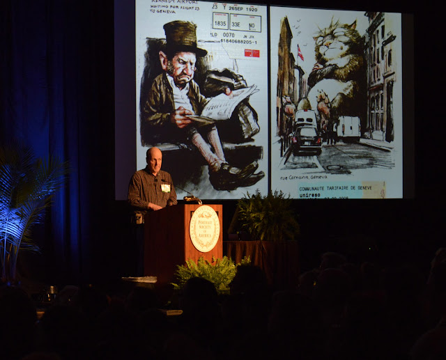
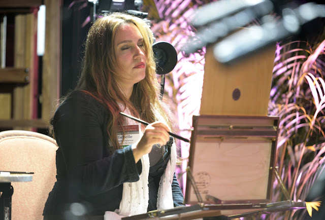
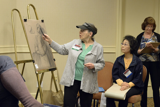
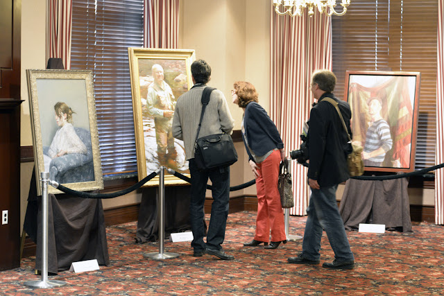
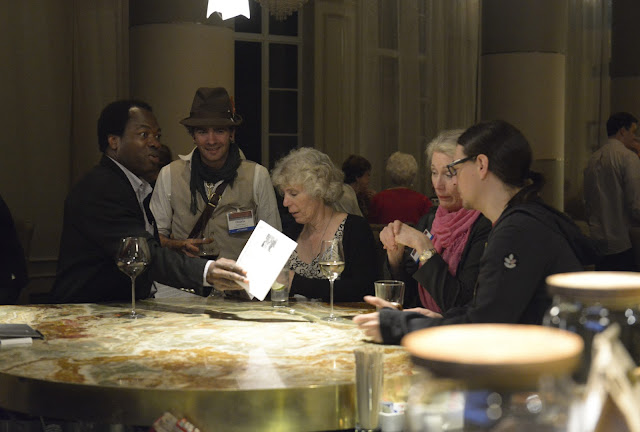
;  his positivity left the audience feeling encouraged to step out, and not to be afraid to leave themselves on their canvases.

In the final presentation of the day, and of the conference, it was artist Quang Ho's turn to thrill the audience with a demonstration he called Finding the Visual Context.  In what was likely the most well-attended Sunday demonstration I have ever seen, the Vietnamese-born, Coloradan artist shared his intellectual and philosophical insights on the art of painting.  Along the way to creating his portrait, Quang shared his belief that each brushstroke he puts down "is a story," and he showed how each little section of one of his paintings formed an abstract, internal artwork which was important to the whole of the painting.  He also explained the relationship between light and shadow, and how important the latter was for telling the story of the environment in which a work was painted.  When his two hours were over, it was hard to tell who was less willing to leave the room - the artist, or the audience.  

At noon, when Chairman Edward Jonas approached the podium, we all knew it was a sign that the curtain had closed on this show, but we also knew that it would open again, on a new day and a new show.  And believe it or not, the next conference promises to have a schedule even more packed than this one!

The Annual Art of the Portrait Conference returns to Reston, Virginia next year.  For updates on conference dates, and to pre-register, please visit the Portrait Society of America's website.  See you there!


Same Adoquei

Quang Ho treating a full house to a painting demonstration and lecture.


"Photographs are useful for note taking, but never project and trace them!"


Of his New Wave palette, Quang Ho said he bought it, "because it looks so cool!"


During the demonstration, James Gurney sat at stage right and sketched Quang Ho at work.


James Gurney's sketch of Quang Ho (see Gurney's post on this sketch on Gurney Journey)


Observing abstract patterns in nature.


Chairman Ed Jonas saying good-bye to the audience

I Found it on eBay

$
0
0

An original oil painting by Paul McCormack, currently up for bid on eBay.


I used to worry that I was addicted to eBay.

Every morning, a bushel full of emails greeted me, filled with details of all the results from the dozens of searches I had saved on the eBay site, and I sat there and dutifully went through each of them.  It's not that I bought a lot - I was just fascinated by the different items that people posted for sale.  And over time, I had gathered some interesting items for my studio, including a hot plate for making mediums, a double boiler, amber bottles, vintage hats, costumes, rare books, quail eggs (hollow), and a bowl-backed mandolin.  I think it was the day I found myself shopping for human skulls - and yes, there are human skulls for sale on eBay (and they are even priced better than their professionally cast, plastic counterparts) - that I decided to rein in my shopping.  (Where were they getting these skulls anyway, and if I bought one, would my demand be fostering someone's grave-robbing side business? The prices were good though . . .)

The one area of eBay I still do monitor from time to time, though, is original art.  Unfortunately, most of the time that I peruse through those auctions, it can be very painful;  there is much chaff to sort through to find the wheat.  But it's still worth the search.

A few years ago, I picked up the little sketch shown below.  I have no idea who drew it, and I can only hope that it is actually from the 19th century.  The seller was located in France, and was selling several images that looked like they were all cut from an old sketchbook.  It is small (approximately 6 X 3 inches), and was inexpensive;  I think I paid $15 for it, which was worth it to me to feel like I owned a piece of history.

The painting below the sketch, "Morning at Superstition," I did not buy.  It was not for a lack of trying, however. The artist, Mick McGinty, was putting up one or two landscapes a week for a while, and I bid on a lot of them.  I was just never the last bid.  Unfortunately, McGinty  stopped listing works about two years ago, otherwise, maybe I would have won one by now.

Currently, I'm watching two auctions of original paintings:  one, a still life by Paul McCormack, and the other, a still life by Clinton Hobart.  I wouldn't mind owning either of them, but I have kids now, so I cannot afford to win either auction.  But I do like to see what's on the auction block, and I enjoy cheering on the bidders.  

And that brings me back to where this all started:  I'm worried I might be addicted to eBay.


Mick McGinty's artwork can be seen at his website, and on his blog, Twice a Week.
The eBay listing for Paul McCormack's still life is 281113035939.
Clinton Hobart's listing is 230986118843


unknown 19th c. French artist


"Morning at Superstition" by Mick McGinty

"Coconut & Mango" by Clinton Hobart, currently on eBay.


Kassan, Schmid, Gerhartz, and Zorn . . .

$
0
0


Now that we are nearly to the halfway mark of 2013, I have been thinking about the many great items scheduled for release this year, and which should be coming out in the next few months.


________________________________________________________________________________


The first of these items that I have been looking forward to is David Kassan's new painting DVD, Painting a Life.  It is a companion piece to his earlier instructional DVD, Drawing Closer to Life, which debuted a few years ago.  Drawing Closer to Life has been highly praised by viewers throughout the world, and Painting a Life promises to be just as popular.  I happened to be on the DVD's website a minute after it went live, and though Kassan was still in the process of tweaking the site at that point, there were already orders coming in.

Painting a Life is six hours long, and follows Kassan throughout his process of creating one of his meticulous portraits in oil paint, from pencil sketch to the final brushstroke.  Included in his progression are discussions about his materials, his studio setup including advice on lighting, how he prepares a panel, and a talk about oil paints and color with Gail Spiegel, one of the founders of Vasari Classic Artists' Oil Colors.  And as a bonus, Kassan, who likes to infuse all of his teaching with comedy, has included a blooper reel at the end of the disc.


As of now, supply is limited to only 250 copies.  Randomly inserted into five of those first 250 sales will be a GOLDEN TICKET which will entitle the holder to a prize package yet to be determined.  These packages are likely to include products from the film's sponsors, and there is also a rumor that one lucky winner might receive an original alla prima painting by Kassan. Kassan has kept the initial supply low to give participants a better chance to win (1 in 50).


The price is $129.95, with free shipping within the United States ($15 global shipping).  It was shot in High Definition Widescreen, and was formatted for Region 0 (universal).  These are pre-sales only;  the actual shipping date is not expected to take place until this winter.

You can place your orders at paintdvd.davidkassan.com.


________________________________________________________________________________


Another item to which I am looking forward to is the release of Richard Schmid's book, Alla Prima II.  Although his earlier book, Alla Prima is one of the best instructional books of the 20th century, Schmid, it appears, felt he could make it even better.  From what I have read online, Alla Prima II appears to be a revised edition of his earlier book, which was originally published 15 years ago.  Alla Prima II will include new written content as well as expanded explanations of the lessons printed in the earlier version. It will feature 262 color plates personally edited by Schmid, and, at an expected 300 pages, it should be NEARLY TWICE THE LENGTH OF THE ORIGINAL BOOK. Alla Prima II is scheduled for release this September.

Please check the West Wind Fine Art website frequently for updates on the book.


________________________________________________________________________________


I have also been looking forward to the release of Daniel Gerhartz's new DVD The Beginning of Autumn.  An earlier DVD of his, Her Mother's Locket, was one of the first painting DVDs I ever purchased, and I cannot wait to add this one to my collection.  I am uncertain when it will be released;  I think it was held up in post-production, but I have my hopes it will be available soon.  For more information, and to keep apprised of the DVD's eventual release, please visit Gerhartz's website, or subscribe to his blog.


________________________________________________________________________________


I am also anticipating the release of the book Anders Zorn: Sweden's Master Painter.  It is due for release October 29, 2013, and is currently available for pre-order at Amazon.com.  The 224 page hardcover is designed to accompany a major retrospective of Zorn's work, to which I am also looking forward.  That show will take place at the Legion of Honor in San Francisco this November.


________________________________________________________________________________


And one last thing (of the many) which I am looking forward to, is Kara Ross' catalogue raisonné on the British artist Edmund Blair Leighton (1852-1922).  I have no idea how much Ms. Ross has completed on this monumental project, and I highly doubt it will be ready to go to print before the end of this year, but I can still dream.  Blair Leighton is one of the artists I greatly admire, and I will be purchasing the book as soon as it does come out.


2013 Prix de West Show

$
0
0

Jeremy Lipking          Vermillion Cliffs (detail)          oil on linen          50" X 70"


The catalog for the 2013 Prix de West Show & Sale is now available for online viewing, and, as usual, the artworks in the exhibit are stunning.  Now in its 40th year, the Prix de West is the premier annual showcase for contemporary Western art, and as such, attracts the biggest names in the field as participants.  This year's show features over 100 artists, many of who have multiple works for sale (I have included only 50 pieces in the images below).  Proceeds from the sale of artworks go towards funding the National Cowboy & Western Heritage Museum in Oklahoma City, Oklahoma, the sponsor and venue of the event.

The opening weekend for the Prix de West is this Saturday and Sunday, June 7th and 8th.  Many events are planned for the weekend, and though they are open to the public, reservations are required.  The show will then remain on view for the next two months.

The National Cowboy & Western Heritage Museum is located at 1700 NE 63rd Street in Oklahoma City, Oklahoma.  For more information on the exhibit, please visit the Prix De Westwebsite.


William Acheff
He Recalled a Quiet Night
oil, 14 X 16 in.

Cyrus Afsary
Storm Cloud
oil, 24 X 30 in.

Bill Anton
Towering Shadows
oil on linen, 40 X 40 in.

Clyde Aspevig
Lightning Dance
oil on canvas, 49 X 60 in.

Carrie L. Ballantyne
Wyoming Blue Eyes
oil, 15 X 12 in.


Greg Beecham
The Maestros - An Exploration of the Melodic Resonance Between Line and Mass
oil on linen, 26 X 42 in.

Christopher Blossom
A Day's Work
oil on linen, 20 X 34 in.

Scott Burdick
Looking at the Gringos
oil, 40 X 60 in.

G. Russell Case
The Shadows of Giants
oil on linen, 16 X 20 in.

Tim Cherry
Racing Razorback
bronze, edition of 18
17.25" h X 30" w X 7.25" d

Len Chmiel
Hidden Treasure
oil, 16 X 22 in.

Scott L. Christensen
April on the Marsh
oil on canvas, 18 X 16 in.

Michael Coleman
On the Milk River
oil on linen, 18.5 X 32.5 in.

Tim Cox
Peace of Mind
oil, 20 X 24 in.

Dennis Doheny
Shadow Dance
oil on linen, 34 X 40 in.

Josh Elliott
Sandstone, Sage and Sand
oil, 32 X 35 in.

John Encinias
The Waning Winter
oil on linen, 30 X 40 in.

Daniel Gerhartz
Golden Braids
oil, 24 X 24 in.

Steve Hanks
Summer Sunset
watercolor, 18 X 41 in.

François Koch
Salt River Canyon
oil on linen, 36 X 42 in.

David A. Leffel
Portrait of Tony Reyna
oil, 20 X 17 in.

Jeremy Lipking
Vermillion Cliffsoil on linen, 50 X 70 in.

Michael J. Lynch
Silhouette
oil on linen, 34 X 44 in.

David Mann
The Pony Guard
oil, 48 X 36 in.

Walter T. Matia
The Rebel Angels
bronze, edition of 20
20" h X 20" w X 8" d

Sherrie McGraw
Dancing Feet
oil, 20 X 17 in.

James Morgan
Drifter
oil on linen, 20 X 30 in.

Terri Kelly Moyers
Contemplation
oil, 36 X 24 in.

Jim C. Norton
Trackers Looking for Sign
oil on linen, 20 X 30 in.

Ralph Oberg
The Title Fight
oil on linen, 32 X 46 in.

Andrew Peters
Teton Fall
oil, 24 X 30 in.

Robert Peters
Midnight Waters
oil, 20 X 24 in.

Kyle Polzin
Trusty Companion
oil on canvas, 23 X 36 in.

Jason Rich
Riding for the 6666s - Bill Owen
oil, 30 X 36 in.

R.S. Riddick
Tradin' Chickens for a Pony
oil on linen, 32 X 22 in.

William Shepherd
Broken Giant
oil on panel, 48 X 64 in.

Daniel Smith
Arctic Aura
acrylic, 24 X 44 in.

Matt Smith
Tonto Giants
oil, 30 X 22 in.

Tucker Smith
Above Roaring Fork
oil on linen, 20 X 28 in.

Tim Solliday
Wanted Poster
oil, 30 X 36 in.

Michael Stack
Sundown Across the Endless Sage
oil on linen, 24 X 36 in.

Craig Tennant
The Witness
oil on linen, 23 X 50 in.

Sonya Terpening
Surprise Party
oil on linen, 18 X 24 in.

Kent Ullberg
Scent of Vixen
bronze, edition of 15
13" h X 19" w X 9" d

Curt Walters
November Wind
oil on canvas, 28 X 22 in.

Jeffrey Watts
The Saddlemaker
oil, 33.25 X 24.5 in.

Morgan Weistling
Crossing the Cheyenne River, Summer 1850
oil on linen, 30 X 50 in.

William Whitaker
Alejandra
oil on panel, 20 X 14 in.

Skip Whitcomb
Into the Light
oil on linen, 20 X 36 in.

Jim Wilcox
Desert Zing
oil on linen, 20 X 30 in.


Viewing all 214 articles
Browse latest View live